Grubhub
Transforming Merchant Onboarding
Role: Senior Product Designer
Timeline: 6 months
Team: Product Manager, Engineers, Content Design, Legal
Responsibilities: Product strategy, AI interaction design, UX research, conversation design, prototyping, usability testing, developer collaboration and handoff
Overview
Overview
Grubhub’s merchant onboarding was built around a sales-assisted process, requiring restaurant owners to navigate a complex signup experience that many struggled to complete independently. I led the end-to-end redesign, partnering with product, engineering, content, and sales to transform onboarding from a manual bottleneck into a scalable self-service acquisition channel. The redesigned experience drove significant gains in conversion, completion, and revenue.

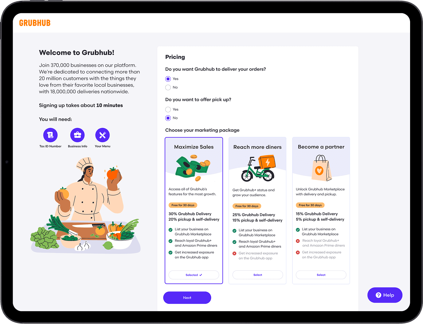
Before Redesign
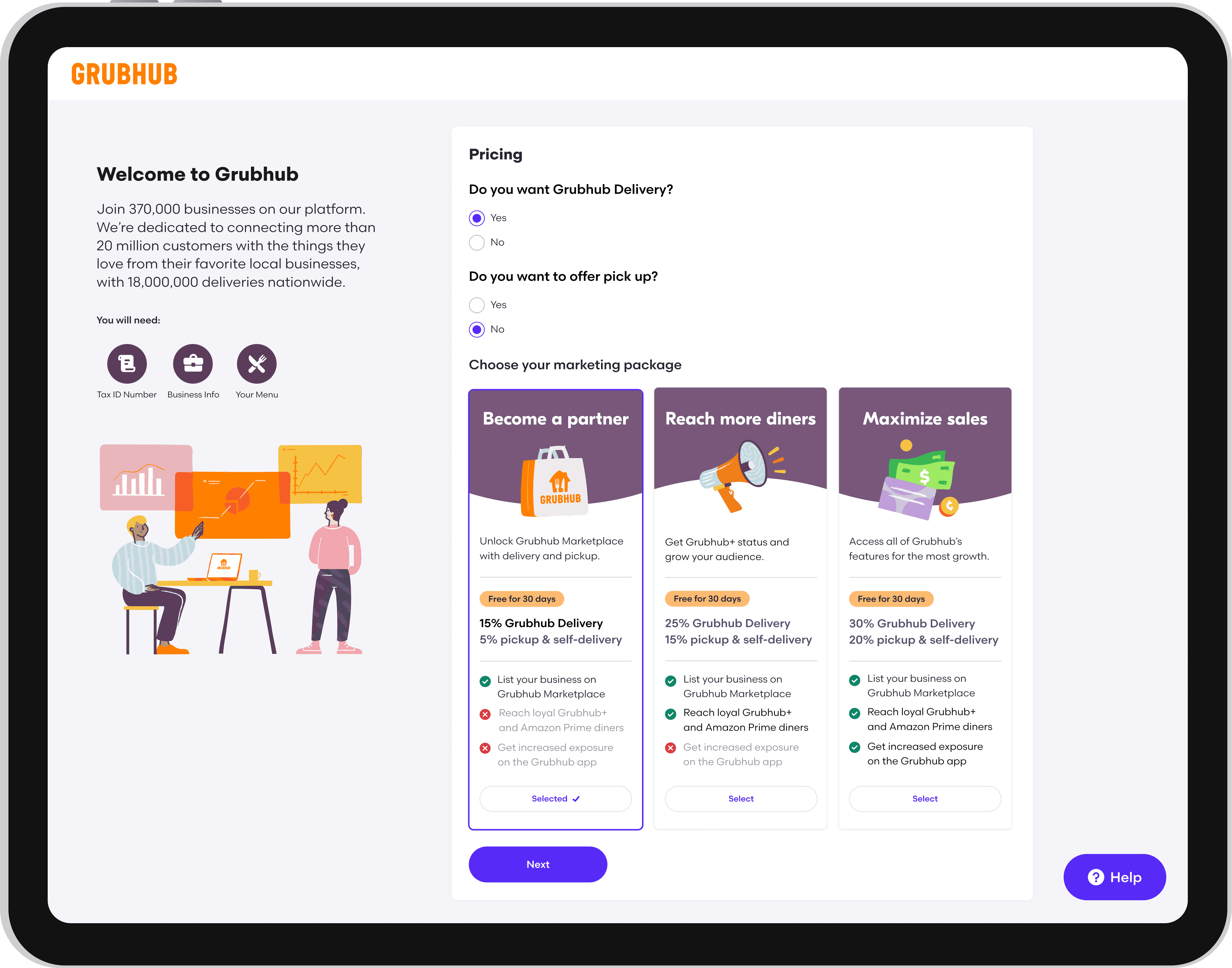
After Redesign
The Opportunity
The Opportunity
Only 1% of merchants could complete onboarding without help from a sales representative.
The existing flow required restaurant owners to locate operational, financial, and business information that they did not always have readily available. When merchants became confused or abandoned the process, sales representatives had to intervene manually.
This created consequences across the business:
Merchant activation took between two and four weeks.
Sales representatives spent time troubleshooting onboarding instead of acquiring new partners.
Restaurants experienced delayed access to the Grubhub marketplace.
Unclear pricing and outdated design patterns weakened trust during a critical first interaction with the brand.
The challenge was not simply to shorten a form. We needed to rethink how Grubhub communicated value, established trust, and supported merchants with different levels of technical confidence.
How might we create an onboarding experience that restaurant owners feel confident completing independently?
How might we create an onboarding experience that restaurant owners feel confident completing independently?
Research & Discovery
Research & Discovery
We combined behavioral data with qualitative research to understand where merchants struggled and why.
Research included:
Pendo surveys within the existing experience
Interviews with approximately 30 restaurant partners
Small focus groups with two to three merchants per session
Analysis of abandonment points and support needs
Feedback from sales representatives who regularly helped merchants complete signup
Three themes emerged
Merchants were unprepared for the information required: 90% of participants said locating the required business information made the process difficult or prevented them from completing it. The experience did not communicate what merchants would need before they began, causing them to leave the flow to search for documents, account details, and restaurant information.
Language created a structural barrier: 35% of merchants required assistance because they were not comfortable completing the experience in English. Translation was not simply an accessibility enhancement. It was necessary for enabling self-service onboarding across Grubhub’s diverse merchant base.
Pricing failed to communicate value: 80% of participants struggled to understand the differences between Grubhub’s plans. The existing experience emphasized fees without clearly explaining the services, reach, or business value included in each option. This increased hesitation at one of the most consequential decision points in the flow.
We combined behavioral data with qualitative research to understand where merchants struggled and why.
Research included:
Pendo surveys within the existing experience
Interviews with approximately 30 restaurant partners
Small focus groups with two to three merchants per session
Analysis of abandonment points and support needs
Feedback from sales representatives who regularly helped merchants complete signup
Three themes emerged:
90%
Felt that locating the required business information made the process difficult
Felt that locating the required business information made the process difficult
35%
35%
Required assistance because they were not comfortable completing the experience in English
Required assistance because they were not comfortable completing the experience in English
80%
80%
Struggled to understand the differences between Grubhub’s plans
Struggled to understand the differences between Grubhub’s plans
Mapping the Journey
Mapping the
Journey
I mapped the experience from initial signup through account configuration and restaurant activation.
The journey map surfaced:
Where merchants needed additional context before continuing
Which information was essential for activation
Which steps could be deferred
Where sales intervention most commonly occurred
When value propositions would be most persuasive
Where proactive support could prevent abandonment
This work aligned the team around a shared definition of the ideal journey and helped product and engineering sequence the experience around merchant needs rather than internal system requirements.

Exploring Directions
Exploring Directions
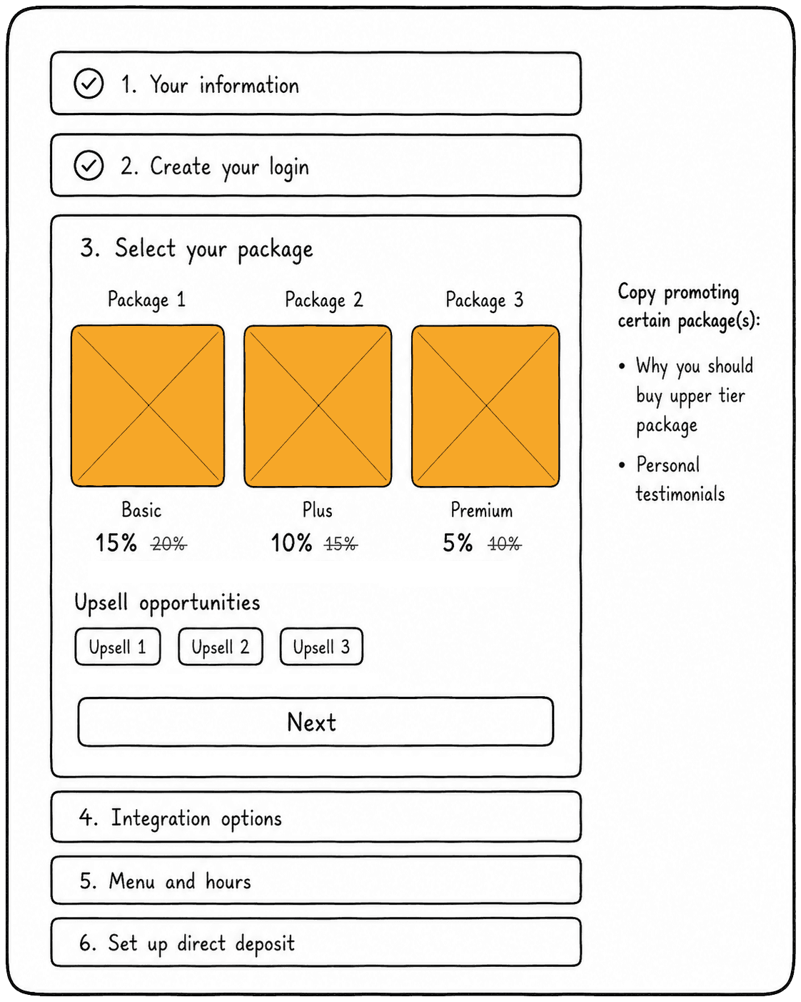
I developed low- and mid-fidelity concepts that explored different ways of organizing the onboarding experience.
The primary directions included:
A traditional multi-page stepper
A single-page accordion
A hybrid model with required and optional sections
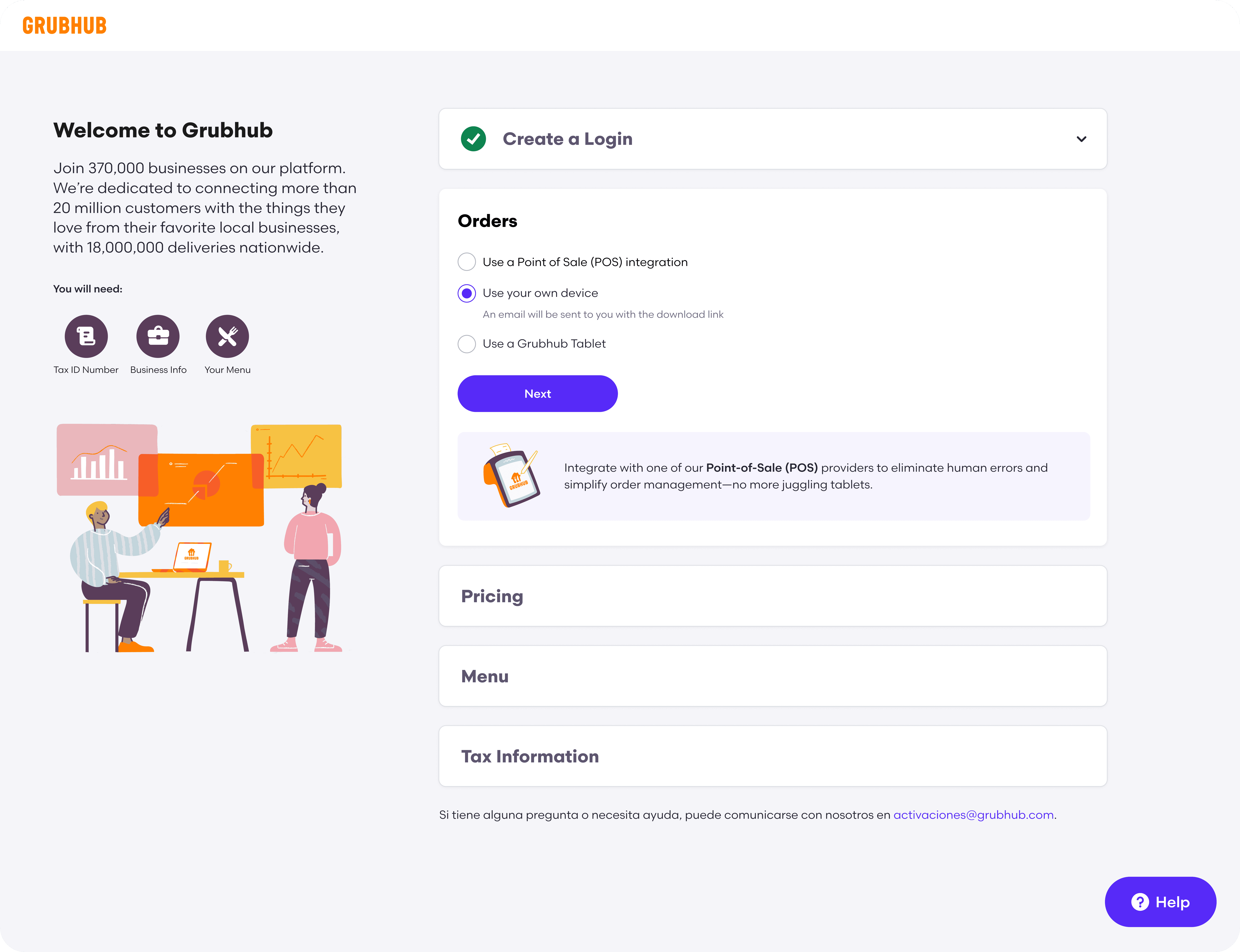
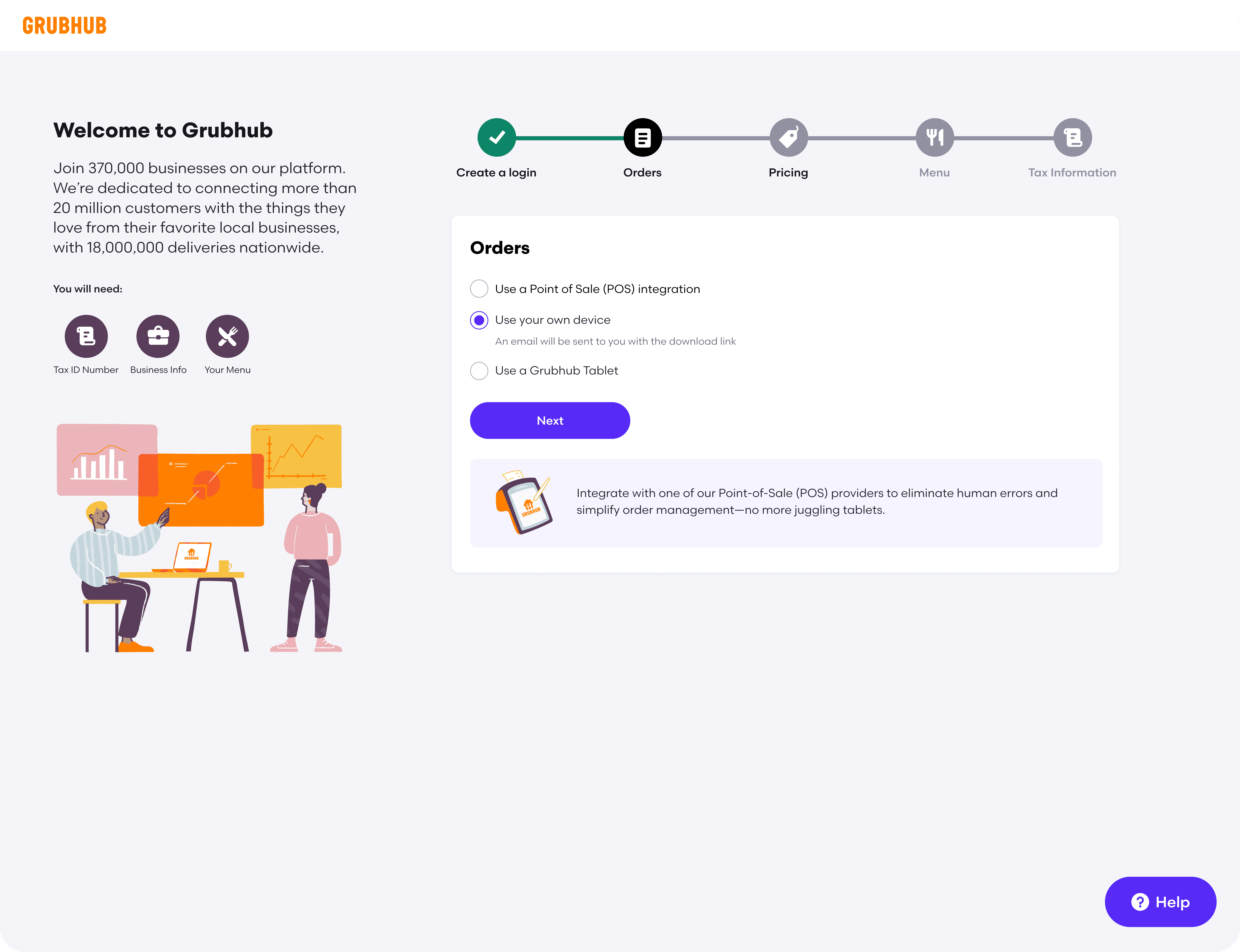
The accordion model gave merchants visibility into the entire process while allowing them to expand, complete, and revisit individual sections without losing context.
This structure also supported a more flexible experience. Merchants could understand their progress, edit previous answers, and defer eligible tasks without navigating backward through multiple pages.


Validating the Experience
Validating the Experience
I conducted moderated usability testing with new Grubhub users, comparing the accordion and stepper models.
Participants were asked to complete realistic signup tasks, locate required information, select a pricing plan, and revise information entered earlier in the flow.
We evaluated:
Task completion
Time on task
Navigation errors
Ability to edit previous responses
Understanding of pricing and requirements
Confidence completing the process without assistance
The accordion design consistently performed better.
Participants found it easier to understand the full scope of onboarding, revisit earlier information, and identify what remained incomplete. The stepper model created confusion when users needed to move backward or understand how much work remained.
These findings gave the team confidence to standardize the experience around the accordion pattern.
DESIGN A
DESIGN A

DESIGN B
DESIGN B

Design Strategy
Design Strategy
I translated the research into four principles that guided product and design decisions. These principles helped the team evaluate tradeoffs and prevented the redesign from becoming a collection of disconnected feature improvements.
Prepare merchants before they begin
Clearly communicate the expected time commitment, required information, and documents upfront.
Demonstrate value before asking for commitment
Introduce relevant benefits, plan features, and pricing context throughout the journey rather than relying on sales representatives to explain them.
Support different levels of readiness
Allow merchants to skip nonessential steps and return to them later instead of forcing every restaurant through the same linear process.
Design for a diverse merchant population
Provide translation, responsive layouts, plain language, and contextual assistance to accommodate different languages, devices, and levels of technical confidence.
The New Experience
The New Experience
Upfront Requirements
Upfront Requirements
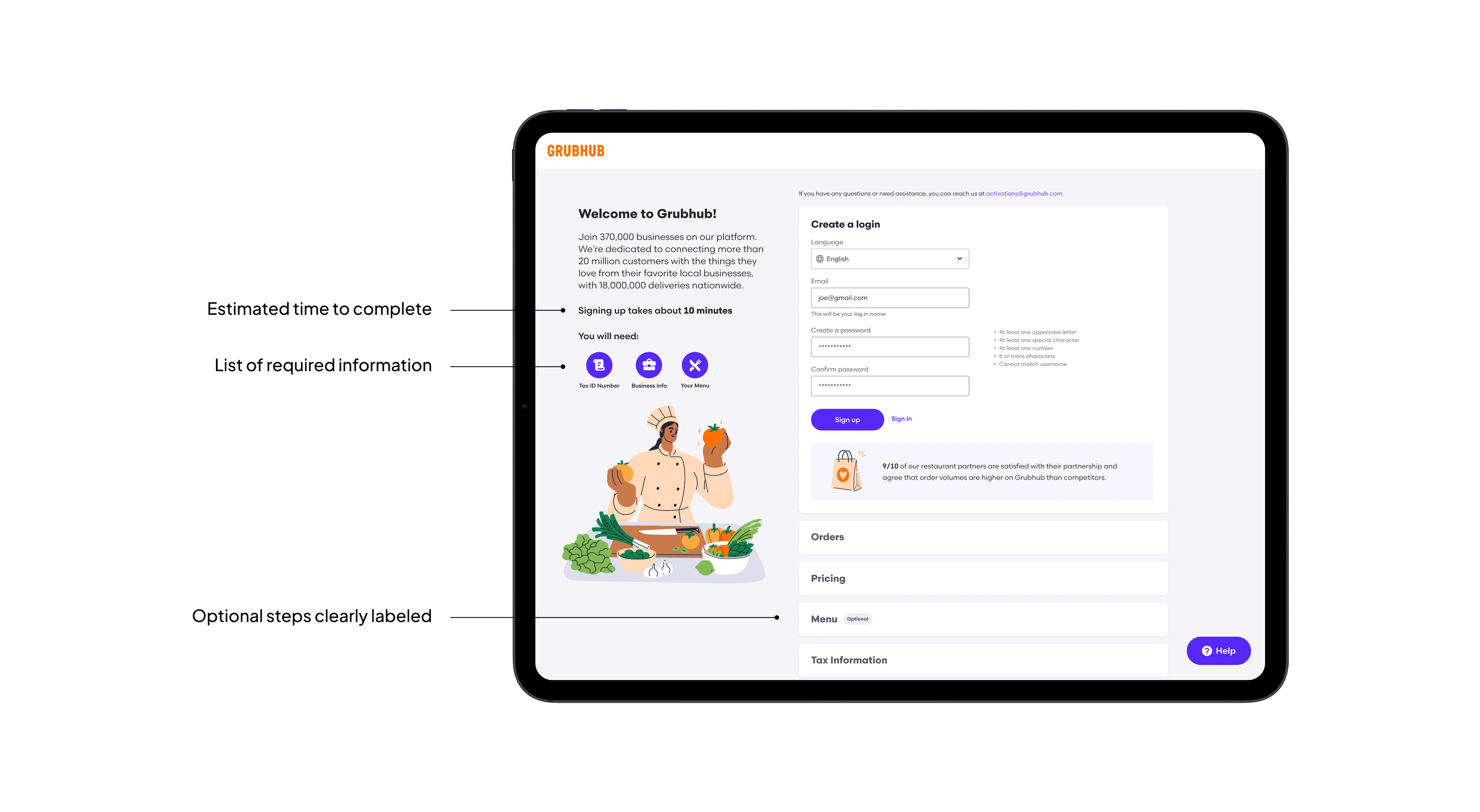
Before beginning, merchants received a clear overview of:
Expected completion time
Information they would need
Optional sections
This helped merchants prepare before entering the flow and reduced unexpected interruptions.

Transparent Plan Selection
Transparent Plan Selection
I redesigned pricing around three outcome-oriented plans:
Become a Partner
Reach More Diners
Maximize Sales
Each option included a scannable comparison of features, exclusions, fees, and expected value. A 30-day free trial reduced the perceived risk of selecting a plan.
Rather than presenting pricing as an isolated transactional decision, the experience connected each plan to the merchant’s business goals.


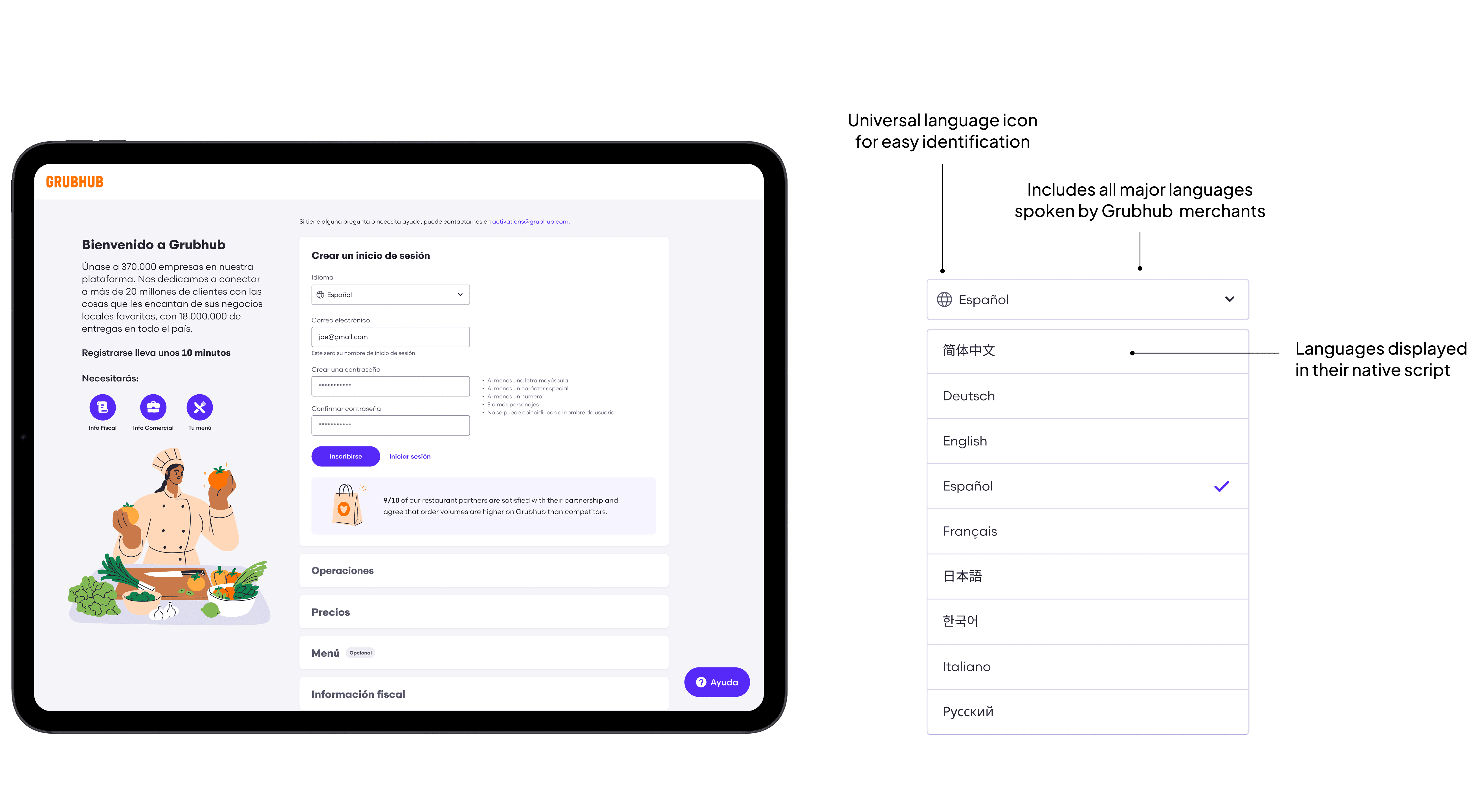
Multilingual Onboarding
Multilingual Onboarding
Merchants could select their preferred language from the initial signup page, translating the full onboarding experience into the languages most commonly used by Grubhub’s merchant community.
Translation was integrated into the experience architecture rather than added as a page-level workaround, creating a consistent journey from signup through completion.

Flexible Completion
Nonessential steps could be skipped and completed later within Grubhub for Restaurants.
This allowed merchants to make progress even when they did not have every piece of information available, while preserving the requirements necessary to activate their account.


AI Guidance
I designed GrubBot, an AI-assisted onboarding companion that provided contextual support without requiring merchants to leave the flow.
GrubBot could:
Explain unfamiliar requirements
Answer frequently asked questions
Clarify terminology
Direct merchants to the appropriate section
Provide structured prompts based on where they were in the process
To make the assistant predictable and trustworthy, I designed clear entry points, constrained response paths, and contextual recommendations rather than relying solely on an open-ended chat interface.
The interaction model was refined through iterative testing to ensure that AI assistance complemented the core experience instead of becoming another layer merchants had to understand.


Responsive Access
The redesigned flow supported desktop, tablet, and mobile devices. This was particularly important for restaurant operators, who often manage their businesses away from a desk and may need to complete onboarding between operational tasks.
Responsive layouts preserved hierarchy, progress visibility, and editing functionality across screen sizes.

My Role
As the lead designer, I was responsible for shaping the experience strategy and translating research into an actionable product direction.
I worked across product, engineering, sales, and content to:
Identify the primary causes of abandonment and assisted onboarding
Define the end-to-end merchant journey
Prioritize improvements based on customer and business impact
Explore and validate alternative interaction models
Introduce AI assistance and multilingual support
Establish responsive patterns across desktop, tablet, and mobile
Support implementation through design reviews and close engineering collaboration
Because the experience affected both merchant acquisition and internal sales operations, I treated onboarding as a service-design problem rather than an isolated interface redesign.
Impacts
The redesign improved both the merchant experience and the scalability of Grubhub’s acquisition process.
150% conversion increase
150% conversion increase
150% conversion increase
150% conversion increase
Merchant conversion increased from 20% to 50% following the redesign.
Merchant conversion increased from 20% to 50% following the redesign.
30× higher completion
30× higher completion
30× higher completion
30× higher completion
The percentage of merchants able to complete onboarding without sales assistance increased from 1% to 30%.
1,500 signups/month
1,500 monthly signups
1,500 signups/month
1,500 signups/month
The new experience generated approximately 1,500 incremental merchant signups each month.
The new experience generated approximately 1,500 incremental merchant signups each month.
Two weeks faster to market
Two weeks faster to market
Two weeks faster to market
Two weeks faster to market
Average time to activation decreased from approximately four weeks to two weeks, enabling restaurants to begin receiving orders 14 days sooner.
Average time to activation decreased from approximately four weeks to two weeks, enabling restaurants to begin receiving orders 14 days sooner.
Reflection
Reflection
The project demonstrated that onboarding was not merely a form-completion problem. It was a critical moment for communicating Grubhub’s value, establishing trust, and setting merchants up for long-term success.
By combining clearer information architecture, transparent pricing, multilingual support, flexible completion, and contextual AI assistance, we created an experience that better served restaurant owners while reducing the organization’s dependence on manual sales support.
The redesign also established reusable patterns for progressive disclosure, plan comparison, responsive workflows, and AI-assisted guidance that could be applied across other merchant experiences.
Grubhub
Grubhub
Increasing onboarding conversion by 150%
Transforming Merchant Onboarding
Transforming Merchant Onboarding
Role: Senior Product Designer
Timeline: 6 months
Team: Product Manager, Engineers, Copy, Sales
Responsibilities: Product strategy, AI interaction design, UX research, conversation design, prototyping, usability testing, developer collaboration and handoff
Grubhub
Transforming Merchant Onboarding
Role: Senior Product Designer
Timeline: 6 months
Team: Product Manager, Engineers, Content Designer, Sales
Responsibilities: Product strategy, UX research, experience design, AI interaction design, prototyping, usability testing, cross-functional alignment, and implementation support
Overview
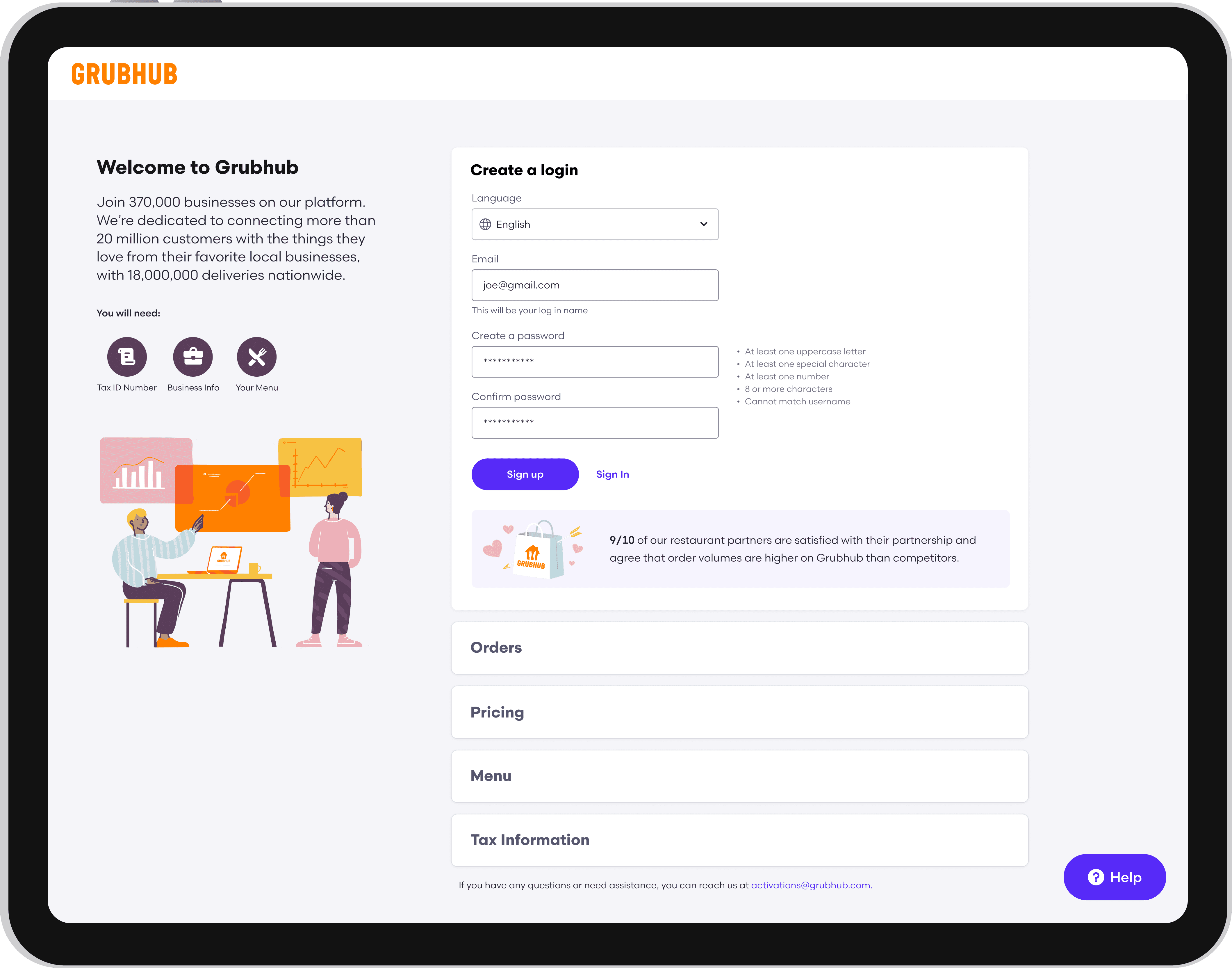
Grubhub’s merchant onboarding was built around a sales-assisted process, requiring restaurant owners to navigate a complex signup experience that many struggled to complete independently. I led the end-to-end redesign, partnering with product, engineering, content, and sales to transform onboarding from a manual bottleneck into a scalable self-service acquisition channel. The redesigned experience drove significant gains in conversion, completion, and revenue.
Before Redesign
After Redesign
My Role
As the lead designer, I was responsible for shaping the experience strategy and translating research into an actionable product direction.
I worked across product, engineering, sales, and content to:
Identify the primary causes of abandonment and assisted onboarding
Define the end-to-end merchant journey
Prioritize improvements based on customer and business impact
Explore and validate alternative interaction models
Introduce AI assistance and multilingual support
Establish responsive patterns across desktop, tablet, and mobile
Support implementation through design reviews and close engineering collaboration
Because the experience affected both merchant acquisition and internal sales operations, I treated onboarding as a service-design problem rather than an isolated interface redesign.
Research & Discovery
We combined behavioral data with qualitative research to understand where merchants struggled and why.
Research included:
Pendo surveys within the existing experience
Interviews with approximately 30 restaurant partners
Small focus groups with two to three merchants per session
Analysis of abandonment points and support needs
Feedback from sales representatives who regularly helped merchants complete signup
Three themes emerged
Merchants were unprepared for the information required: 90% of participants said locating the required business information made the process difficult or prevented them from completing it. The experience did not communicate what merchants would need before they began, causing them to leave the flow to search for documents, account details, and restaurant information.
Language created a structural barrier: 35% of merchants required assistance because they were not comfortable completing the experience in English. Translation was not simply an accessibility enhancement. It was necessary for enabling self-service onboarding across Grubhub’s diverse merchant base.
Pricing failed to communicate value: 80% of participants struggled to understand the differences between Grubhub’s plans. The existing experience emphasized fees without clearly explaining the services, reach, or business value included in each option. This increased hesitation at one of the most consequential decision points in the flow.
90%
Felt that locating the required business information made the process difficult
35%
Required assistance because they were not comfortable completing the experience in English
80%
Struggled to understand the differences between Grubhub’s pricing plans
Mapping the Journey
I mapped the experience from initial signup through account configuration and restaurant activation.
The journey map surfaced:
Where merchants needed additional context before continuing
Which information was essential for activation
Which steps could be deferred
Where sales intervention most commonly occurred
When value propositions would be most persuasive
Where proactive support could prevent abandonment
This work aligned the team around a shared definition of the ideal journey and helped product and engineering sequence the experience around merchant needs rather than internal system requirements.
Exploring Directions
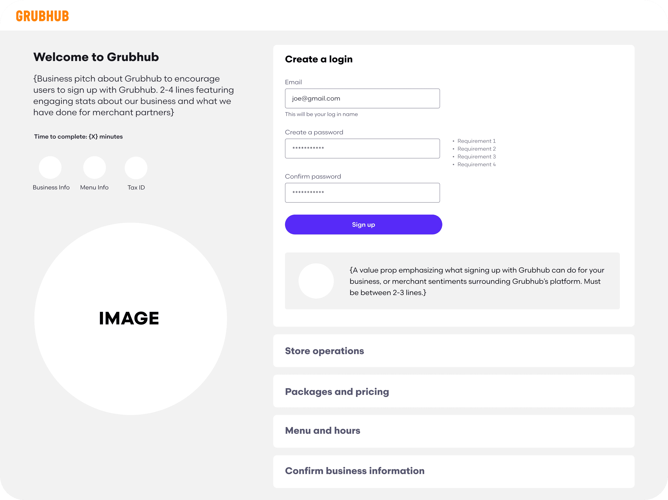
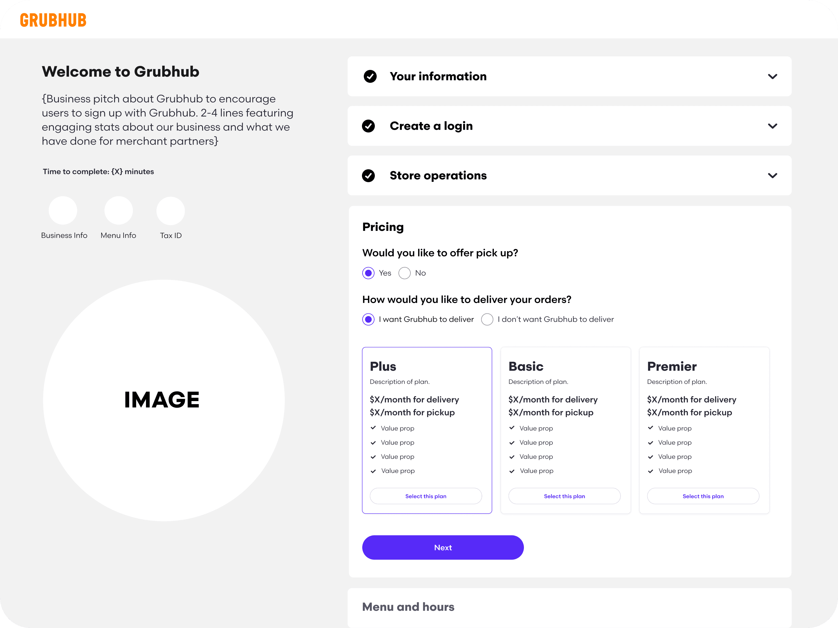
I developed low- and mid-fidelity concepts that explored different ways of organizing the onboarding experience.
The primary directions included:
A traditional multi-page stepper
A single-page accordion
A hybrid model with required and optional sections
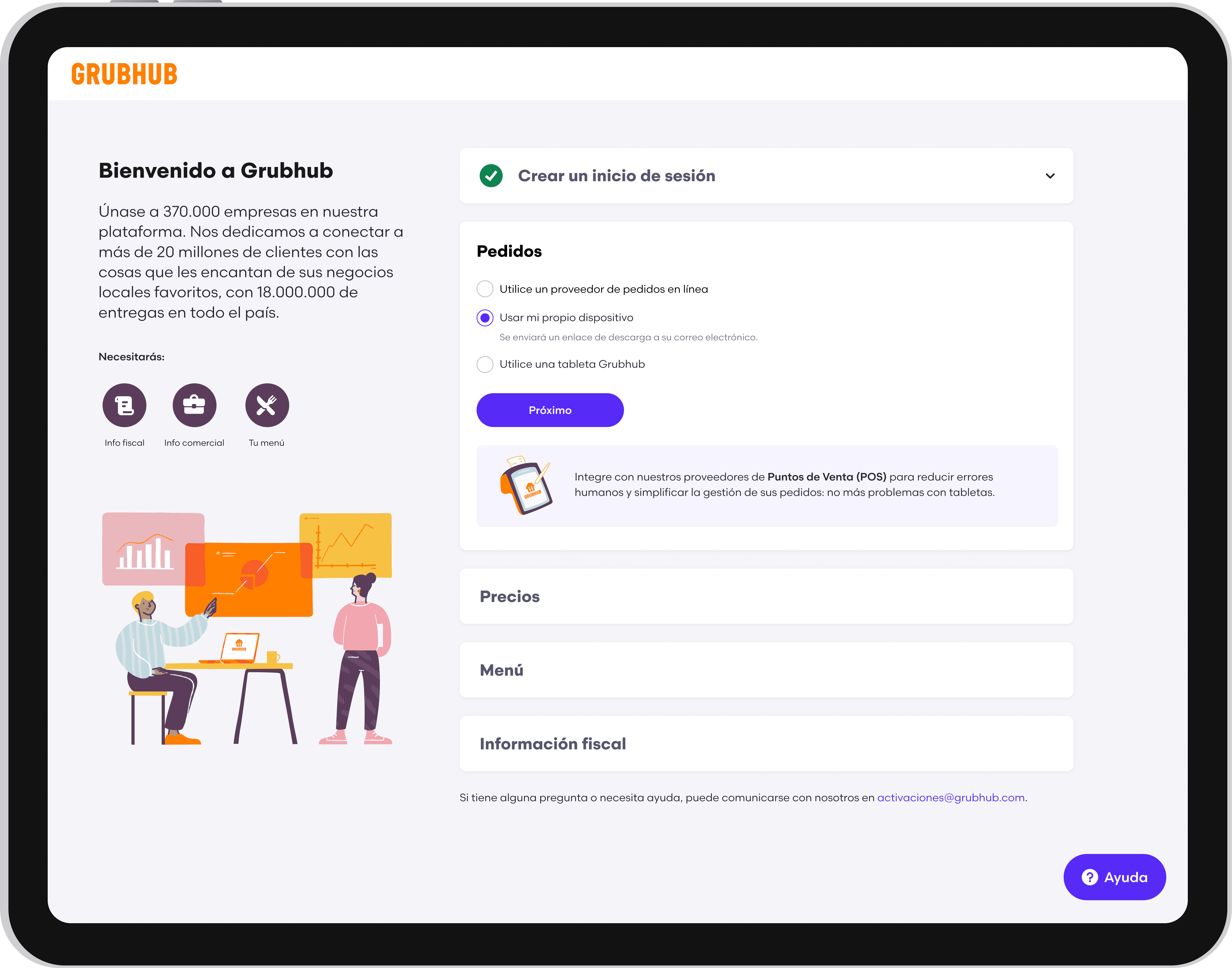
The accordion model gave merchants visibility into the entire process while allowing them to expand, complete, and revisit individual sections without losing context.
This structure also supported a more flexible experience. Merchants could understand their progress, edit previous answers, and defer eligible tasks without navigating backward through multiple pages.
Validating the Experience
I conducted moderated usability testing with new Grubhub users, comparing the accordion and stepper models.
Participants were asked to complete realistic signup tasks, locate required information, select a pricing plan, and revise information entered earlier in the flow.
We evaluated:
Task completion
Time on task
Navigation errors
Ability to edit previous responses
Understanding of pricing and requirements
Confidence completing the process without assistance
The accordion design consistently performed better. Participants found it easier to understand the full scope of onboarding, revisit earlier information, and identify what remained incomplete. The stepper model created confusion when users needed to move backward or understand how much work remained. These findings gave the team confidence to standardize the experience around the accordion pattern.
DESIGN B
DESIGN A
DESIGN A
DESIGN B
The New Experience
I redesigned pricing around three outcome-oriented plans:
Become a Partner
Reach More Diners
Maximize Sales
Each option included a scannable comparison of features, exclusions, fees, and expected value. A 30-day free trial reduced the perceived risk of selecting a plan.
Rather than presenting pricing as an isolated transactional decision, the experience connected each plan to the merchant’s business goals.
Transparent Plan Selection
Upfront Requirements
Before beginning, merchants received a clear overview of:
Expected completion time
Information and documents they would need
Required and optional sections
What would happen after submission
This helped merchants prepare before entering the flow and reduced unexpected interruptions.Rather than presenting pricing as an isolated transactional decision, the experience connected each plan to the merchant’s business goals.
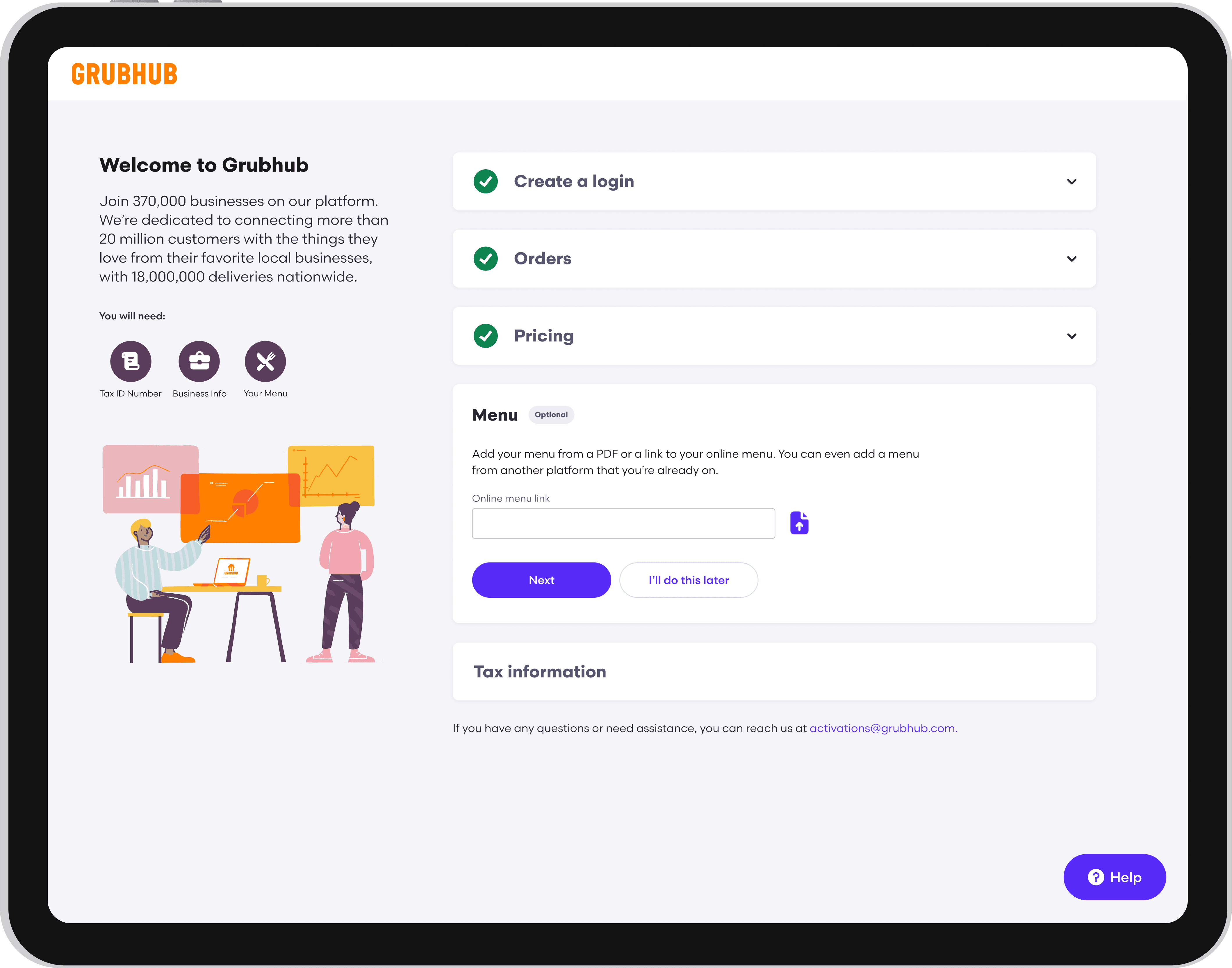
Flexible Completion
Nonessential steps could be skipped and completed later within Grubhub for Restaurants.
This allowed merchants to make progress even when they did not have every piece of information available, while preserving the requirements necessary to activate their account.
Multilingual Onboarding
Merchants could select their preferred language from the initial signup page, translating the full onboarding experience into the languages most commonly used by Grubhub’s merchant community.
Translation was integrated into the experience architecture rather than added as a page-level workaround, creating a consistent journey from signup through completion.
AI Guidance
I designed GrubBot, an AI-assisted onboarding companion that provided contextual support without requiring merchants to leave the flow.
GrubBot could:
Explain unfamiliar requirements
Answer frequently asked questions
Clarify terminology
Direct merchants to the appropriate section
Provide structured prompts based on where they were in the process
To make the assistant predictable and trustworthy, I designed clear entry points, constrained response paths, and contextual recommendations rather than relying solely on an open-ended chat interface.
The interaction model was refined through iterative testing to ensure that AI assistance complemented the core experience instead of becoming another layer merchants had to understand.

Responsive Access
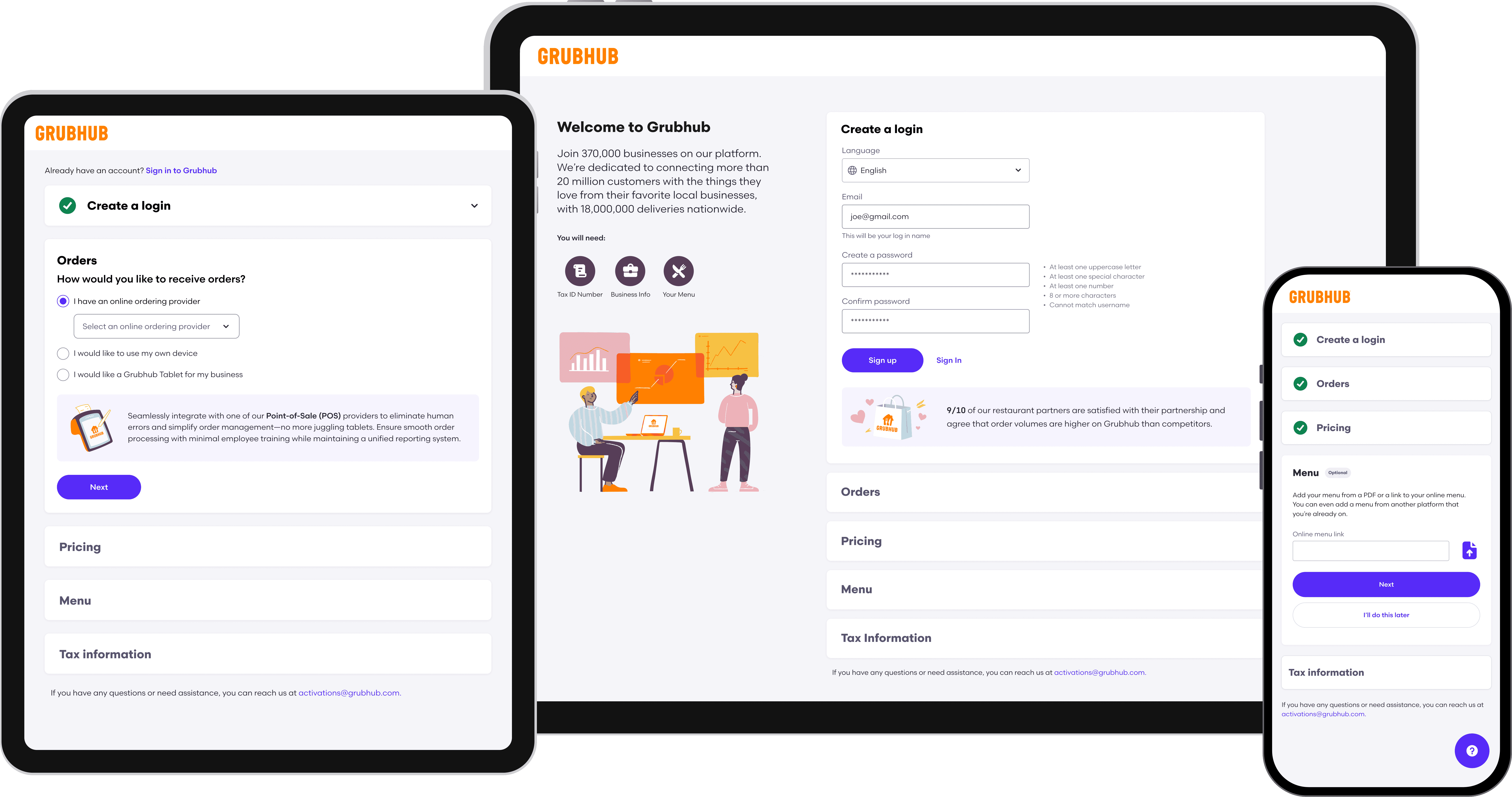
The redesigned flow supported desktop, tablet, and mobile devices. This was particularly important for restaurant operators, who often manage their businesses away from a desk and may need to complete onboarding between operational tasks.
Responsive layouts preserved hierarchy, progress visibility, and editing functionality across screen sizes.
The Opportunity
Only 1% of merchants could complete onboarding without help from a sales representative.
The existing flow required restaurant owners to locate operational, financial, and business information that they did not always have readily available. When merchants became confused or abandoned the process, sales representatives had to intervene manually.
This created consequences across the business:
Merchant activation took between two and four weeks.
Sales representatives spent time troubleshooting onboarding instead of acquiring new partners.
Restaurants experienced delayed access to the Grubhub marketplace.
Unclear pricing and outdated design patterns weakened trust during a critical first interaction with the brand.
The challenge was not simply to shorten a form. We needed to rethink how Grubhub communicated value, established trust, and supported merchants with different levels of technical confidence.
How might we create an onboarding experience that restaurant owners feel confident completing independently?
Design Strategy
I translated the research into four principles that guided product and design decisions. These principles helped the team evaluate tradeoffs and prevented the redesign from becoming a collection of disconnected feature improvements.
Prepare merchants before they begin
Clearly communicate the expected time commitment, required information, and documents upfront.
Demonstrate value before asking for commitment
Introduce relevant benefits, plan features, and pricing context throughout the journey rather than relying on sales representatives to explain them.
Support different levels of readiness
Allow merchants to skip nonessential steps and return to them later instead of forcing every restaurant through the same linear process.
Design for a diverse merchant population
Provide translation, responsive layouts, plain language, and contextual assistance to accommodate different languages, devices, and levels of technical confidence.
Impacts
The redesign improved both the merchant experience and the scalability of Grubhub’s acquisition process.
30× higher independent completion
The percentage of merchants able to complete onboarding without sales assistance increased from 1% to 30%.
150% increase in conversion
Merchant conversion increased from 20% to 50% following the redesign.
1,500 additional signups per month
The new experience generated approximately 1,500 incremental merchant signups each month.
Estimated $25 million in annual revenue impact
Based on the value of additional activated merchants, the increase in signup volume represented an estimated $25 million in additional annual revenue.
Two weeks faster to market
Average time to activation decreased from approximately four weeks to two weeks, enabling restaurants to begin receiving orders 14 days sooner.
30× higher completion
The percentage of merchants able to complete onboarding without sales assistance increased from 1% to 30%.
150% conversion increase
Merchant conversion increased from 20% to 50% following the redesign.
1,500 signups/month
The new experience generated approximately 1,500 incremental merchant signups each month.
$1.84 million/year
Based on the value of additional activated merchants, the increase in signup volume represented an estimated $1.84 million in additional annual revenue.
Two weeks faster to market
Average time to activation decreased from approximately four weeks to two weeks, enabling restaurants to begin receiving orders 14 days sooner.
Reflection
The project demonstrated that onboarding was not merely a form-completion problem. It was a critical moment for communicating Grubhub’s value, establishing trust, and setting merchants up for long-term success.
By combining clearer information architecture, transparent pricing, multilingual support, flexible completion, and contextual AI assistance, we created an experience that better served restaurant owners while reducing the organization’s dependence on manual sales support.
The redesign also established reusable patterns for progressive disclosure, plan comparison, responsive workflows, and AI-assisted guidance that could be applied across other merchant experiences.
The New Experience
I redesigned pricing around three outcome-oriented plans:
Become a Partner
Reach More Diners
Maximize Sales
Each option included a scannable comparison of features, exclusions, fees, and expected value. A 30-day free trial reduced the perceived risk of selecting a plan.
Rather than presenting pricing as an isolated transactional decision, the experience connected each plan to the merchant’s business goals.
Transparent Plan Selection
Upfront Requirements
Before beginning, merchants received a clear overview of:
Expected completion time
Information they would need
Optional sections
This helped merchants prepare before entering the flow and reduced unexpected interruptions.
Multilingual Onboarding
Merchants could select their preferred language from the initial signup page, translating the full onboarding experience into the languages most commonly used by Grubhub’s merchant community.
Translation was integrated into the experience architecture rather than added as a page-level workaround, creating a consistent journey from signup through completion.
Flexible Completion
Nonessential steps could be skipped and completed later within Grubhub for Restaurants.
This allowed merchants to make progress even when they did not have every piece of information available, while preserving the requirements necessary to activate their account.
AI Guidance
I designed GrubBot, an AI-assisted onboarding companion that provided contextual support without requiring merchants to leave the flow.
GrubBot could:
Explain unfamiliar requirements
Answer frequently asked questions
Clarify terminology
Direct merchants to the appropriate section
Provide structured prompts based on where they were in the process
To make the assistant predictable and trustworthy, I designed clear entry points, constrained response paths, and contextual recommendations rather than relying solely on an open-ended chat interface.
The interaction model was refined through iterative testing to ensure that AI assistance complemented the core experience instead of becoming another layer merchants had to understand.

Responsive Access
The redesigned flow supported desktop, tablet, and mobile devices. This was particularly important for restaurant operators, who often manage their businesses away from a desk and may need to complete onboarding between operational tasks.
Responsive layouts preserved hierarchy, progress visibility, and editing functionality across screen sizes.