Self Sign-Up
Grubhub
Optimizing Grubhub’s sign-up experience to allow merchants to join the Grubhub platform without the help of a sales representative
ROLE
Product Designer II
TEAM
Myself, (1) Product Manager, (4) Frontend Engineers, (2) Backend Engineers, (1) Copy Partner, (3) Sales Partners
SKILLS
User Research, Prototyping, Wireframing, Usability Testing, Interaction Design
The Problem
Fewer than 1% of merchant partners were able to complete the sign-up process independently, forcing Grubhub sales reps to manually assist with signups.
This increased their workload and extended the onboarding timeline to an average of 2-4 weeks—significantly longer than the 3-5 day industry standard.
The delays frustrated our partners, preventing them from reaching diners and resulting in lost potential sales.
Additionally, the outdated design contributed to a poor user experience and lacked brand consistency, further diminishing engagement and trust.
HMW create a sign-up experience that merchants can complete on their own?
The Solution
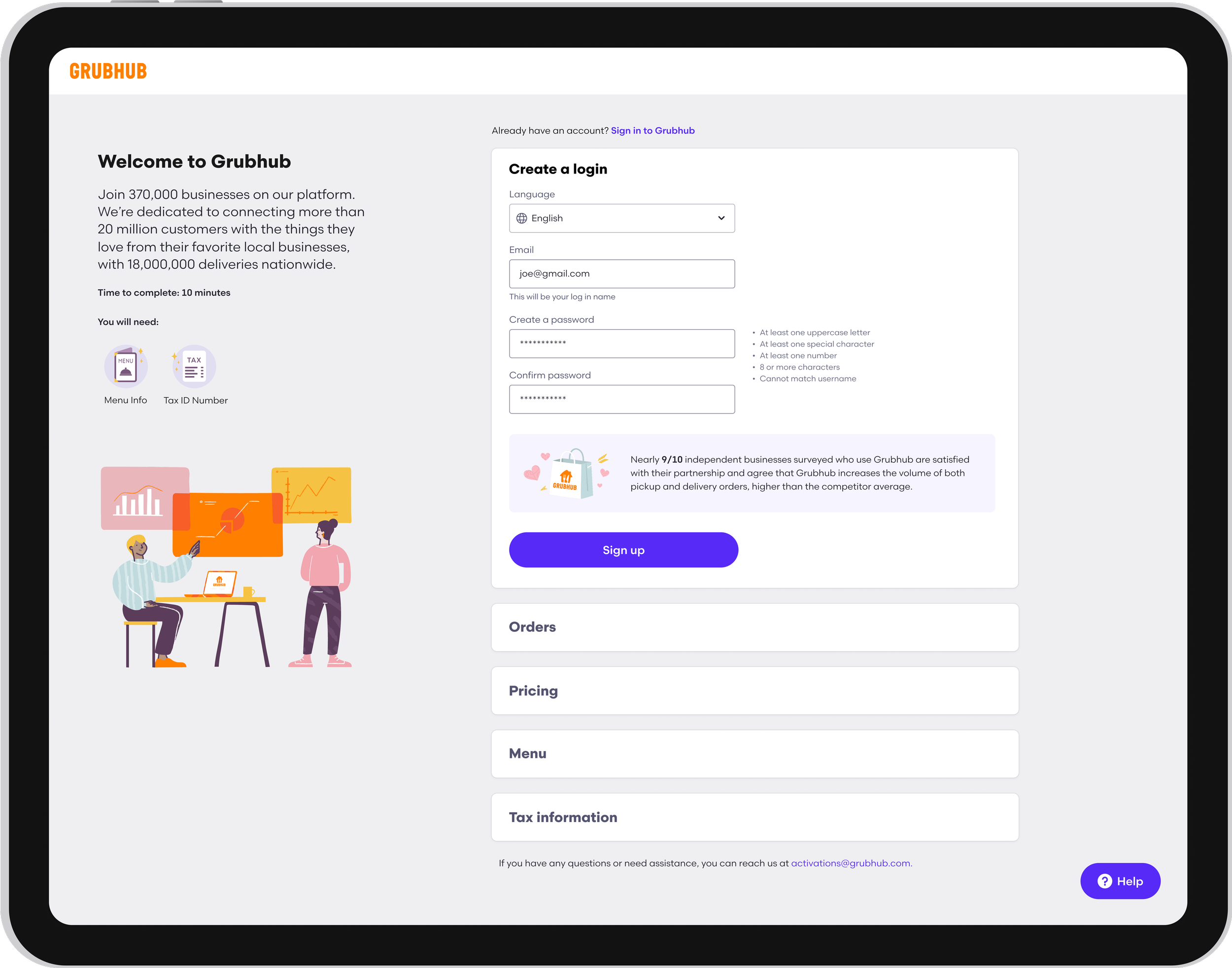
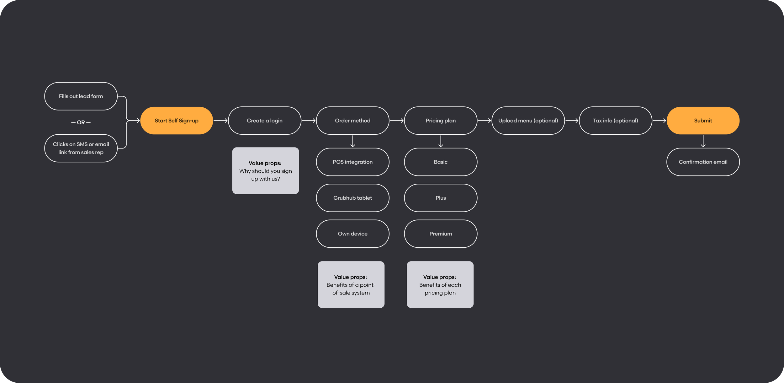
We created a revamped signup flow that offers a simpler, more engaging, and user-friendly experience for prospective merchants. We optimized the process by reducing steps, making some fields optional, and simplifying language for clarity. To improve accessibility, we added language translation for merchant partners with language barriers. Clear pricing breakdowns and 30-day free trials help ease decision fatigue, while time estimates and required information upfront improve completion rates. Additionally, engaging illustrations and compelling value propositions encourage signups. The redesign also streamlines sales team onboarding by collecting key business details early.
Learning from Merchants
To determine the best solution, we conducted Pendo surveys to gather feedback on the existing flow, interviewed around 30 merchant partners, and held focus groups with 2-3 partners at a time to ask them about their experience signing up with Grubhub.
90%
Couldn’t complete the flow because of the time it took to locate required information.
20-30%
Required assistance from a sales representative due to a language barrier.
70%
Struggled to understand the value of our offerings, particularly our marketing plans.
Defining Our Goals

Language translation
Provide translation for the most common languages, Spanish and Mandarin.

Value propositions
Highlight value to reinforce our benefits and support informed decision-making.

Engaging visuals
Delight users with engaging visuals throughout the process.

Clear pricing plans
Show well-structured plans with cost breakdowns and included features.

Key requirements
Be upfront about the information and time needed to complete the flow.

Optional steps
Enable users to skip steps for a more flexible experience.
Developing the Solution
01 // Brainstorming
After evaluating our research insights, I hosted a brainstorming session in FigJam with my partners to get aligned and define which steps we wanted to include in the flow. We also worked to determine ways we could demonstrate the value users get from signing up, alleviate decision fatigue, and engage our users throughout the process.
02 // Flow mapping
Next, I outlined the steps for the flow, identifying opportunities for users to skip certain steps and strategically placing value propositions for maximum impact.
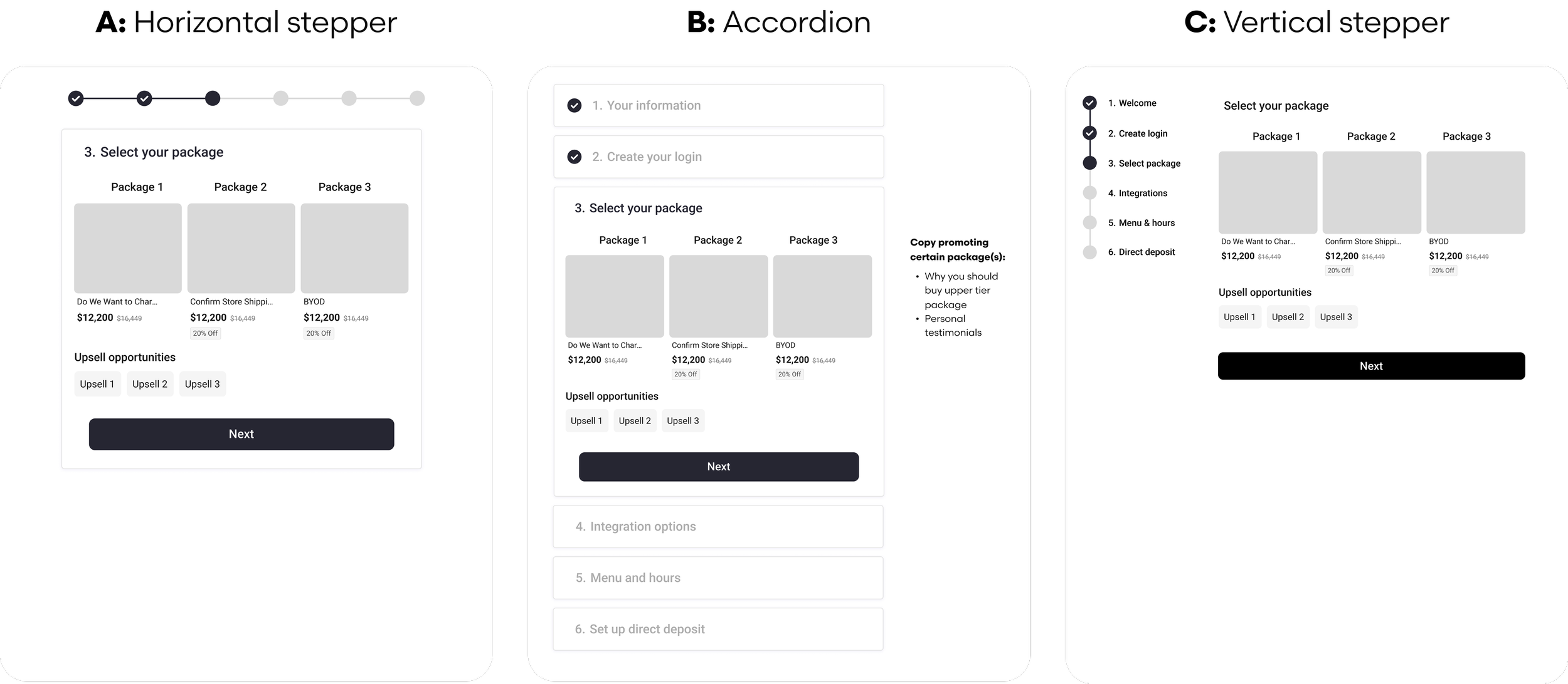
03 // Wireframing
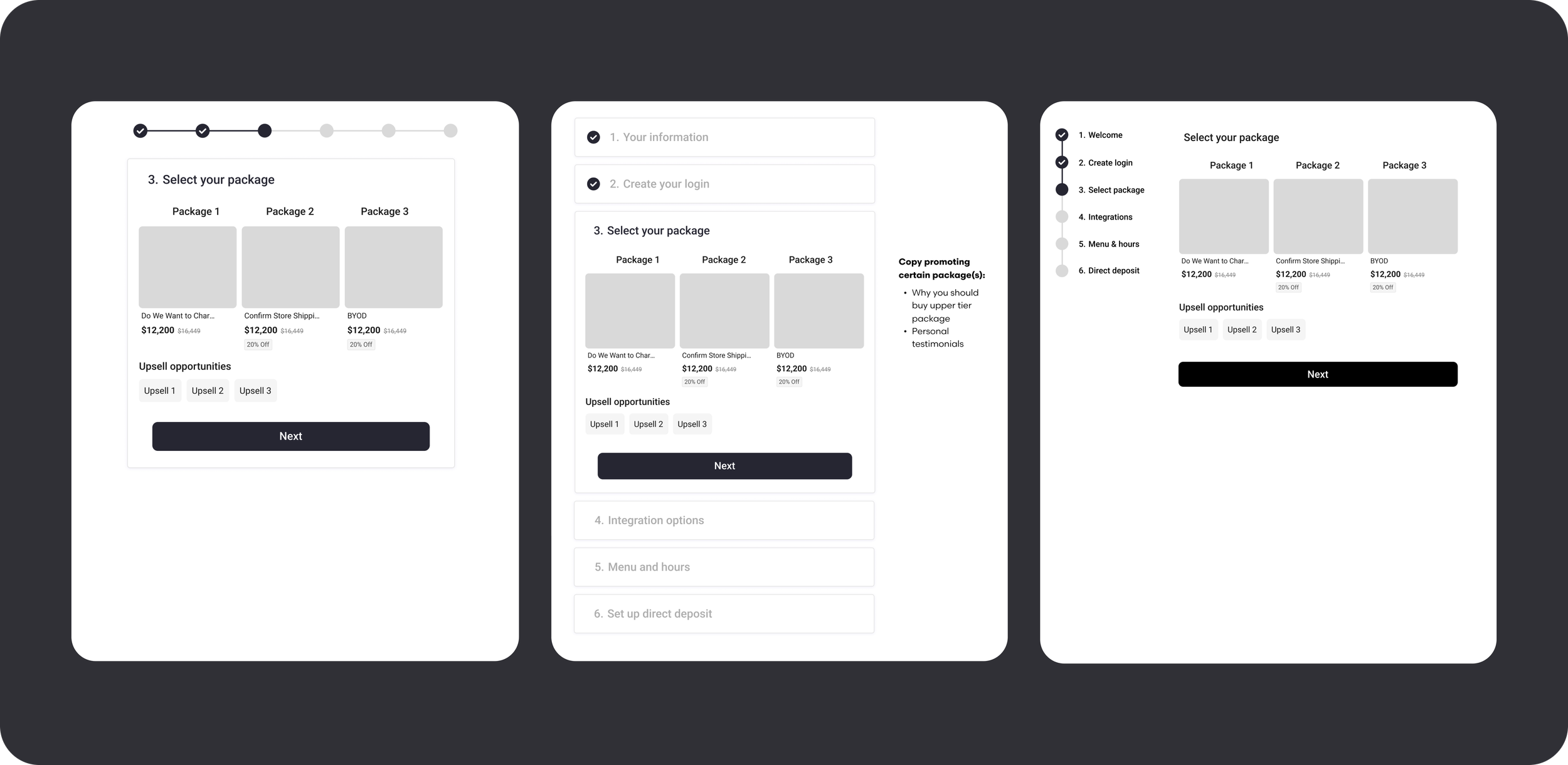
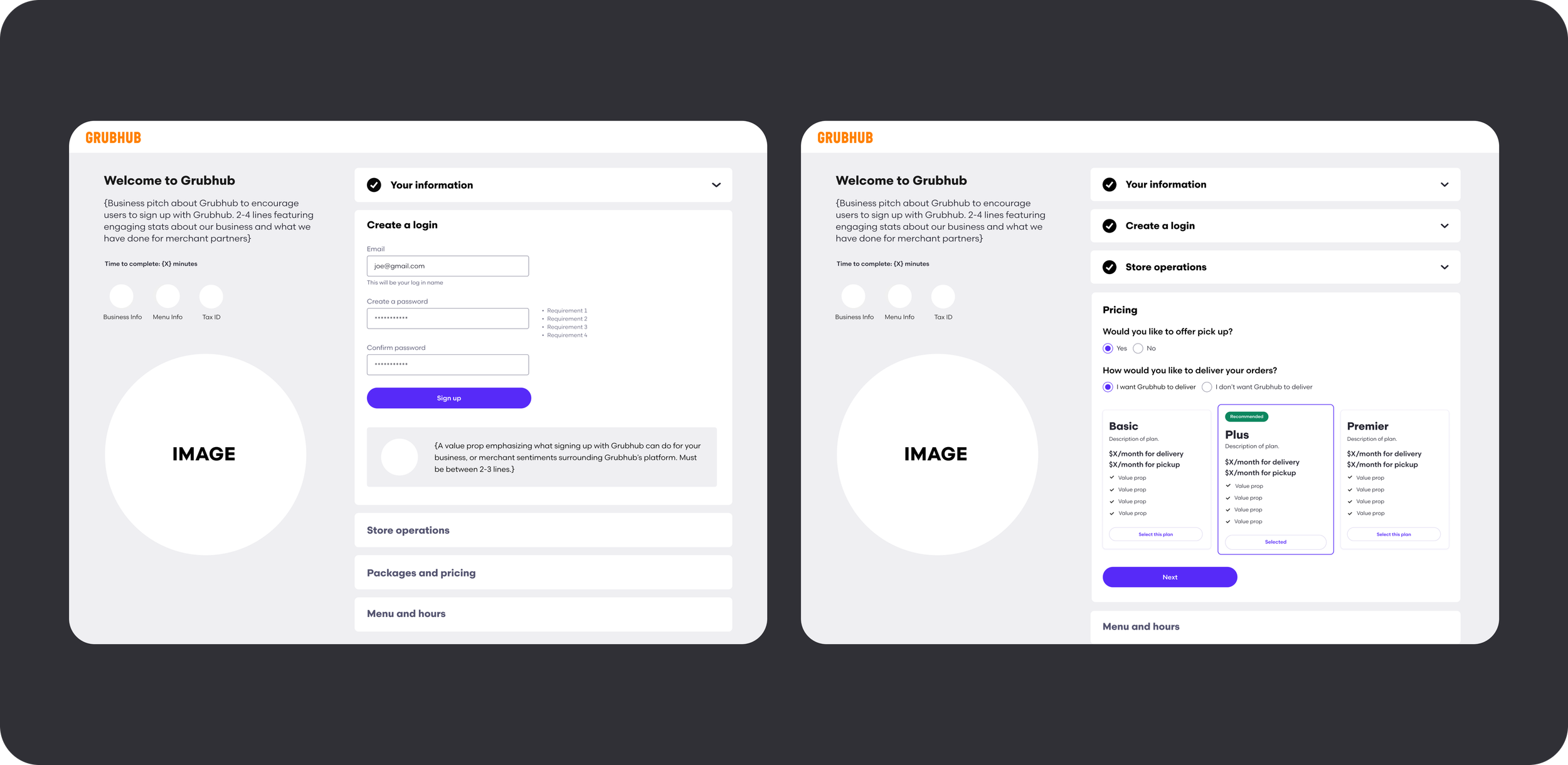
In the wireframing stage, I worked to determine the best way to organize the required information, experimenting with 3 different directions: a horizontal stepper approach, an accordion design, and a vertical stepper. I felt that the accordion design might work best to organize the complex information and allow users to reference previously submitted fields. This is especially important for our busy partners who might have to walk away during the process and want to check on what they submitted so far. I synced with my partners to review each option and conducted user testing to determine the best approach.
04 // Mid-fidelity designs
After landing on the accordion approach, I began to flesh out the designs and determine where we can add value props, imagery, and helpful information, such as the time needed to complete the flow and the materials required. I also focused on building more comprehensive pricing plans, making decisions such as which plan to recommend, how to emphasize certain plans, and how to provide transparency around our costs.
05 // High-fidelity designs
When transitioning to high-fidelity, I built components for the new accordion, ensuring seamless integration with our design system. I carefully selected illustrations from our library to enhance approachability and engagement. I also finalized our pricing plans, incorporating on-brand visuals and descriptions for each plan, clear cost breakdowns for delivery and pickup, an easy-to-follow presentation of plan offerings, and a 30-day free trial to help with decision fatigue.
User Testing
I conducted moderated user testing with seven new Grubhub users to evaluate the usability of different signup flows, measuring task completion, time, errors, and user feedback. The accordion design outperformed the others, especially when users needed to edit previously entered information, earning higher intuitiveness ratings and showing fewer errors. Stepper designs occasionally caused confusion, with some users unsure how to navigate backward.
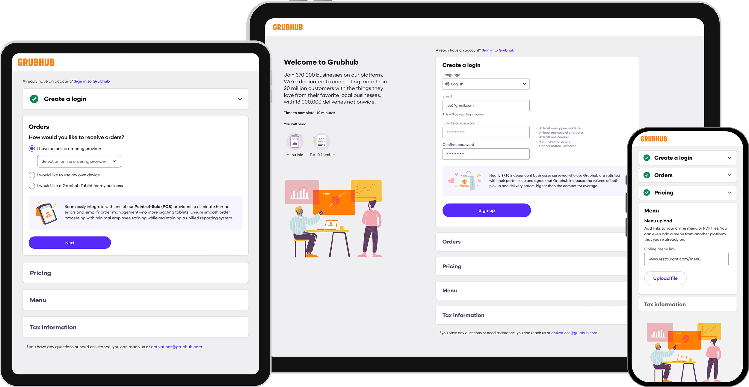
I made sure the designs function seamlessly across mobile and tablet devices, providing flexibility for busy merchants who lack time to use a desktop and enabling sales reps to onboard new merchants in person.
Making it Responsive
Leveraging AI
To further enhance the intuitiveness and efficiency of the signup process, I designed an AI assistant called GrubBot to guide merchants through onboarding, provide real-time support, answer FAQs, clarify requirements, and help reduce drop-off rates. I focused on creating a user-friendly chatbot UI with clear prompts, structured decision paths, and proactive assistance. Through iterative testing and user feedback, I continuously refined the experience to maximize engagement and conversion.

The Results

150% increase in conversion
Conversion more than doubled.

1,400 more signups
Within one month after launch.

Reduced time-to-live by 10 days
Resulting in an increase of $1.84M in yearly revenue for merchants on Grubhub.