
Grubhub
SMB Onboarding
I worked closely with Grubhub’s product team to redesign the sign-up flow and onboarding experience for when a new restaurant joins Grubhub Marketplace. Through a rigorous process of competitive and analogous research, user testing, and cross-team collaboration, we designed a flow that’s efficient and easy to use.
Position: Product Designer II
Tools: Figma, Adobe Illustrator
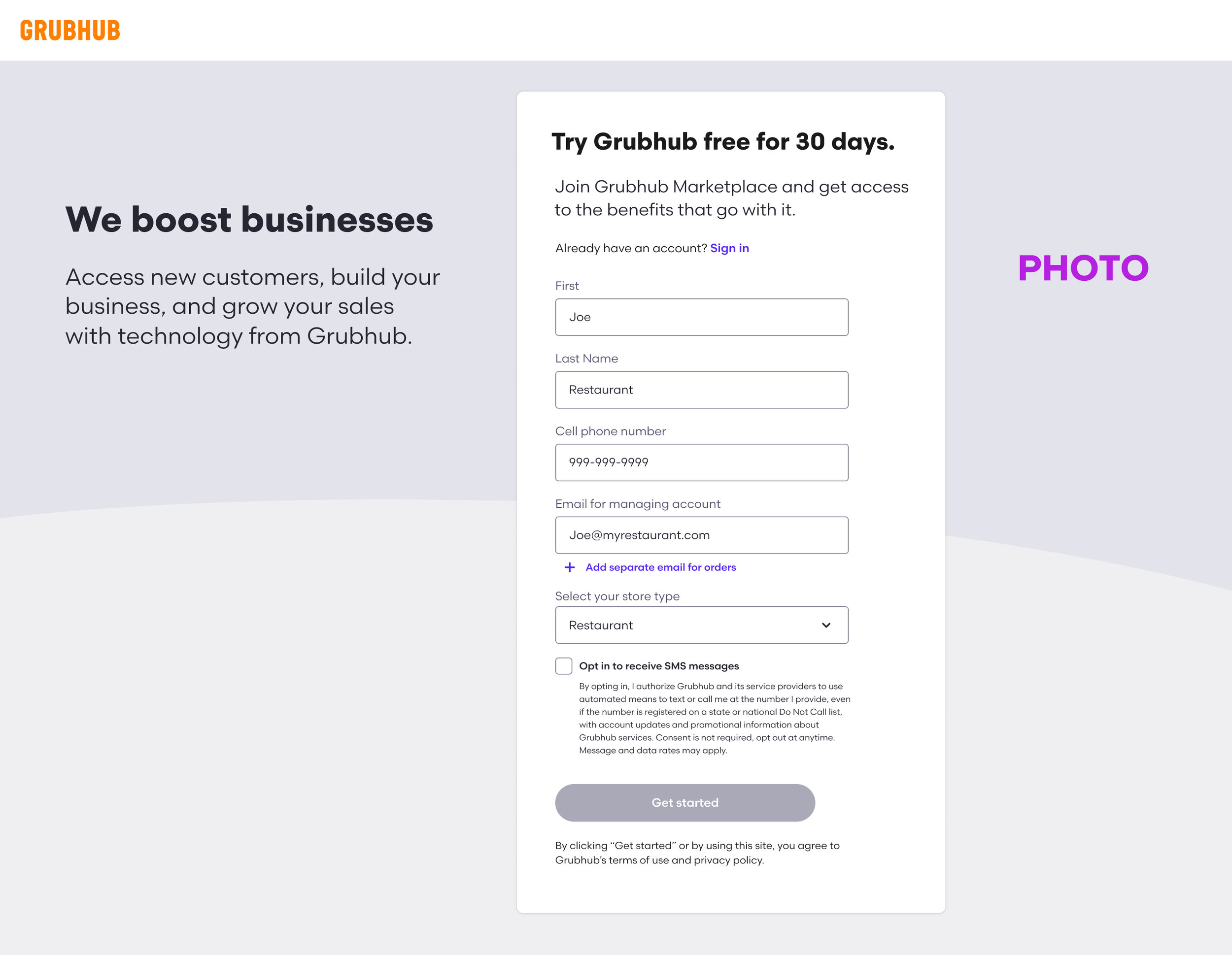
Lead capture Form
The user begins their signup journey on Get.Grubhub—the marketing site that Grubhub uses to attract new businesses. To start the process, we ask them to fill out their basic information using a lead capture form. This provides data for our sales representatives to get a head start on their end.
We designed this form to be clean and simple with as few fields as possible. A lot of information was still required for our sales team to collect, so we envisioned the form to only show some of the fields upfront, and have additional fields populate to collect their store information once their store type is selected.
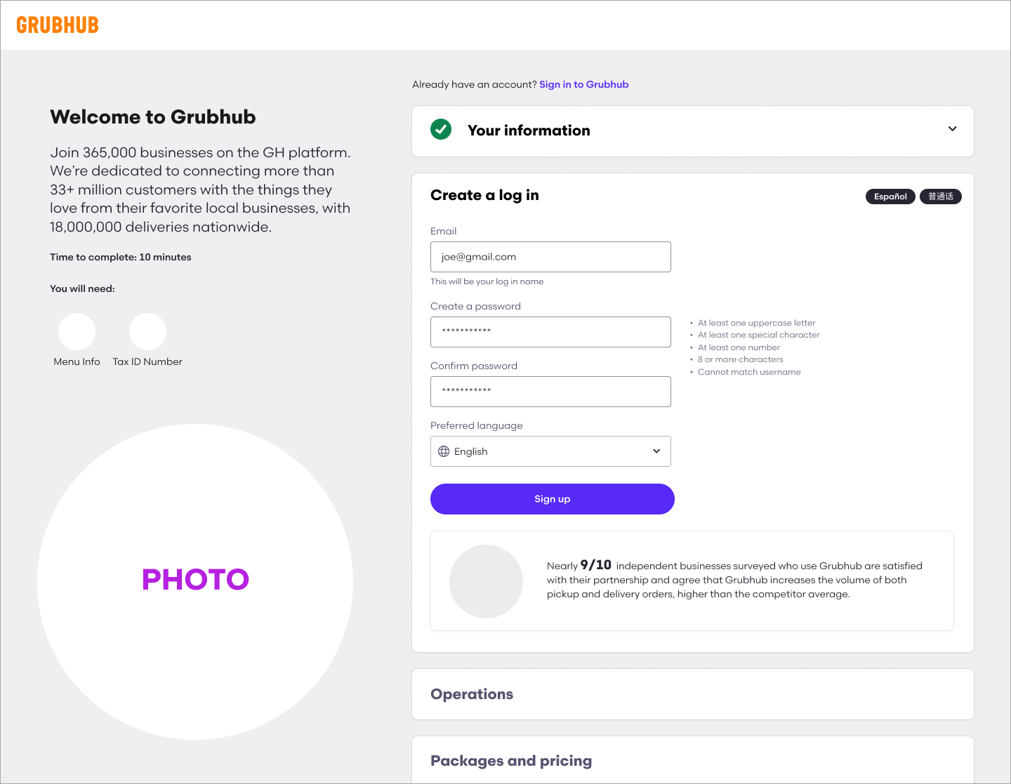
Self Sign-up flow
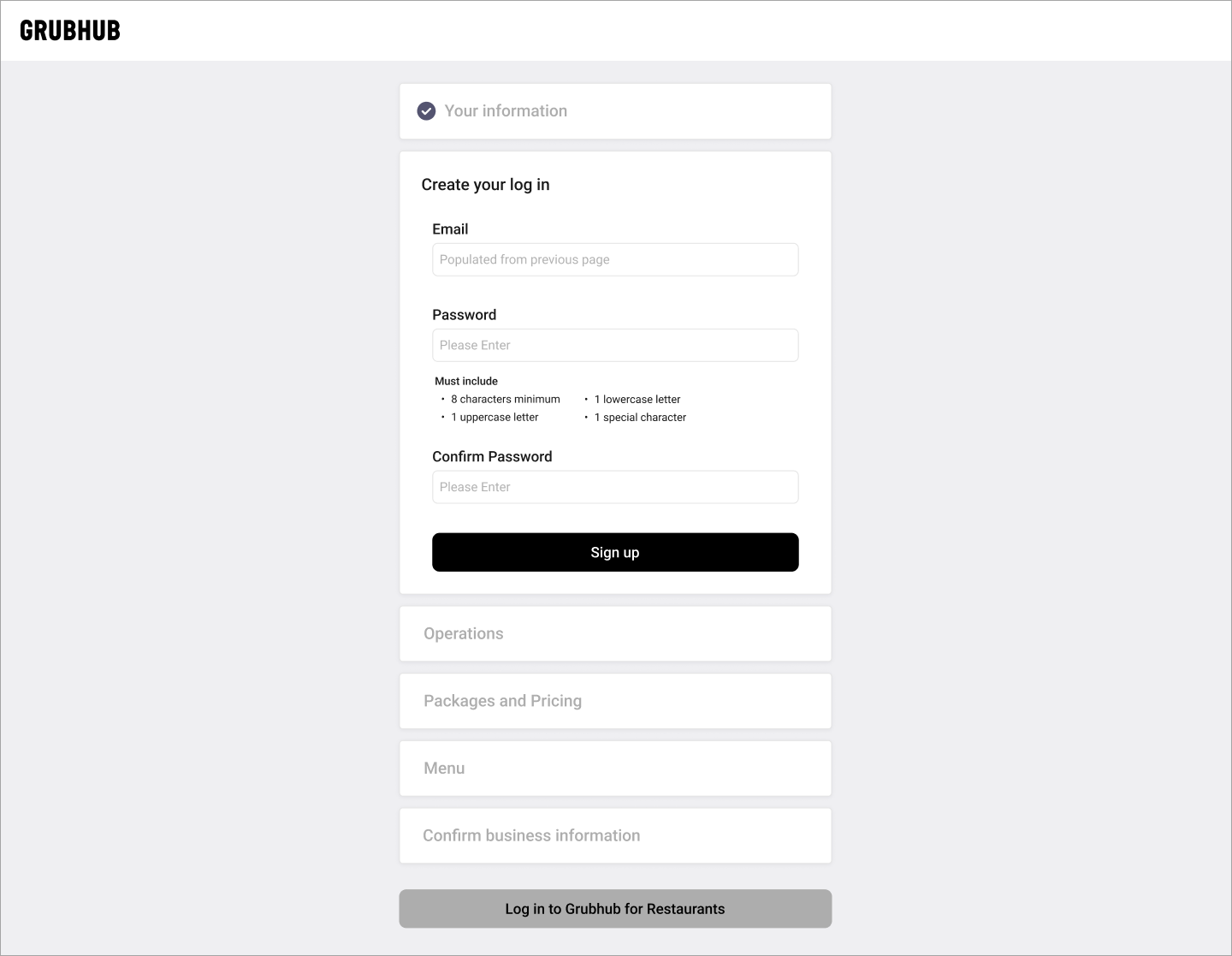
After completing the lead capture form, the user is brought to the Self-Sign Up experience. This flow is intended to collect in-depth information from businesses and allows sales and menu-building teams to get a head start with internal onboarding processes. Upon landing on the page, the user will see the “Your Information” section already completed, which contains their basic information from the lead capture form and allows them to make edits if needed. They will then proceed with a five-step process to join Grubhub Marketplace.
Our goal was to make the signup as efficient as possible to allow businesses to complete the flow autonomously. The previous experience only had a 1% completion rate, which created a burden for Grubhub’s sales reps who had to sign them up themselves. To incite engagement and transparency, we provided a summary of Grubhub’s services, a time estimate for completion, and a list of what they will need throughout the process. We laid out each step in straightforward accordions that prevent the user from viewing future tasks until they have completed the current one, helping to maintain their focus. In addition to fresh, clean, and simple UI, we added eye-catching illustrations to add delight throughout the experience.
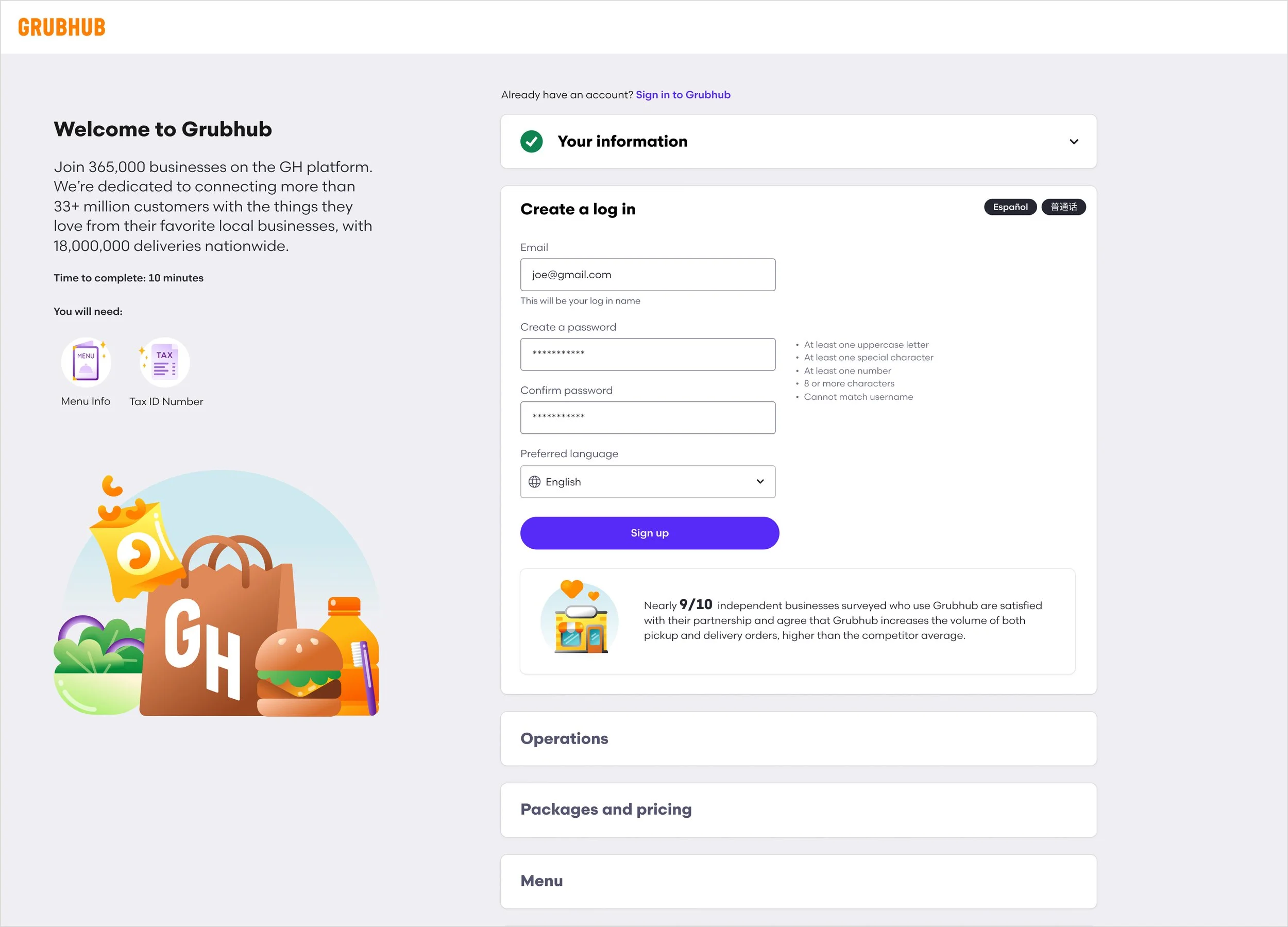
Step 1: Create a Login
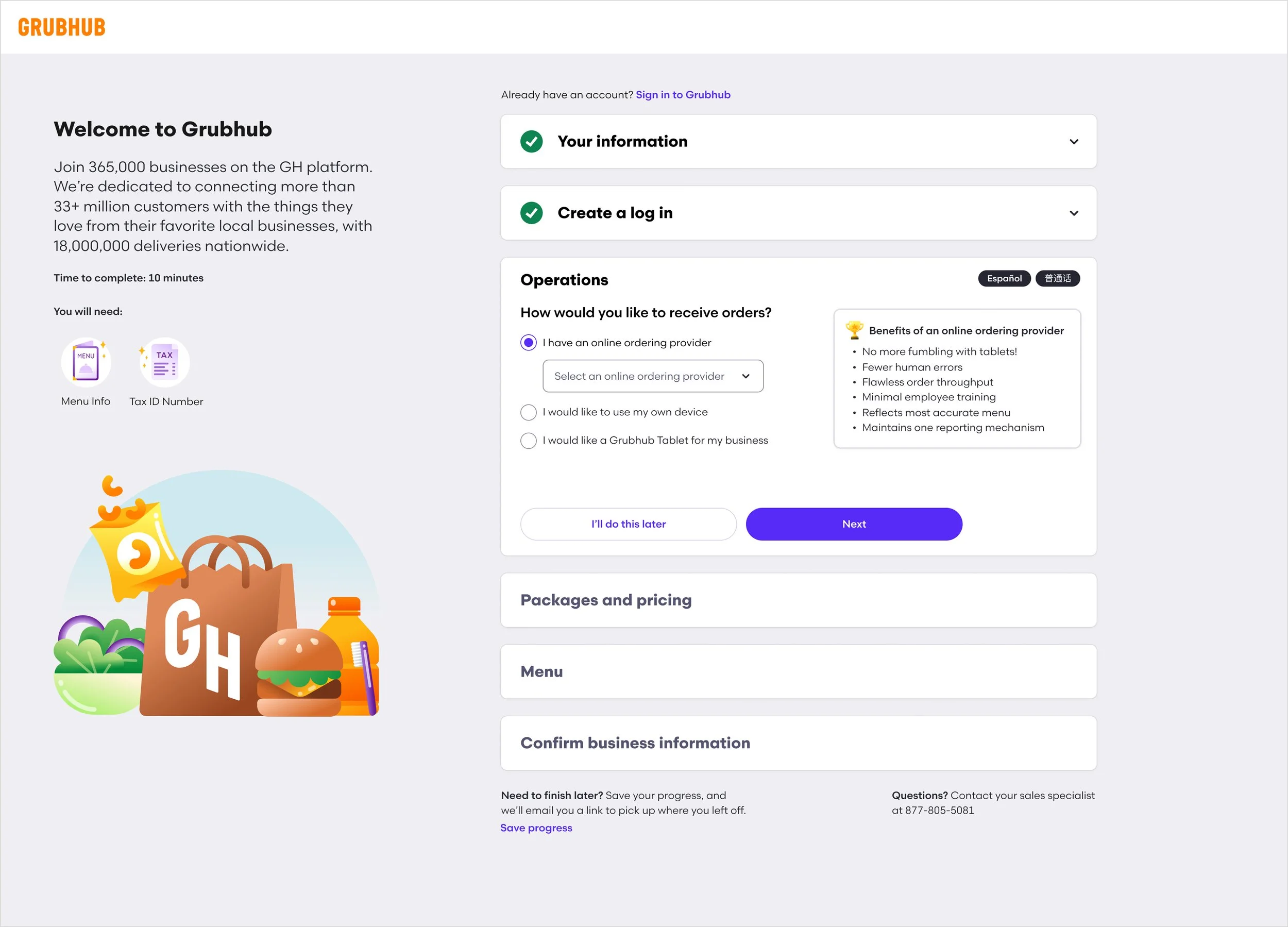
Step 2: Operations
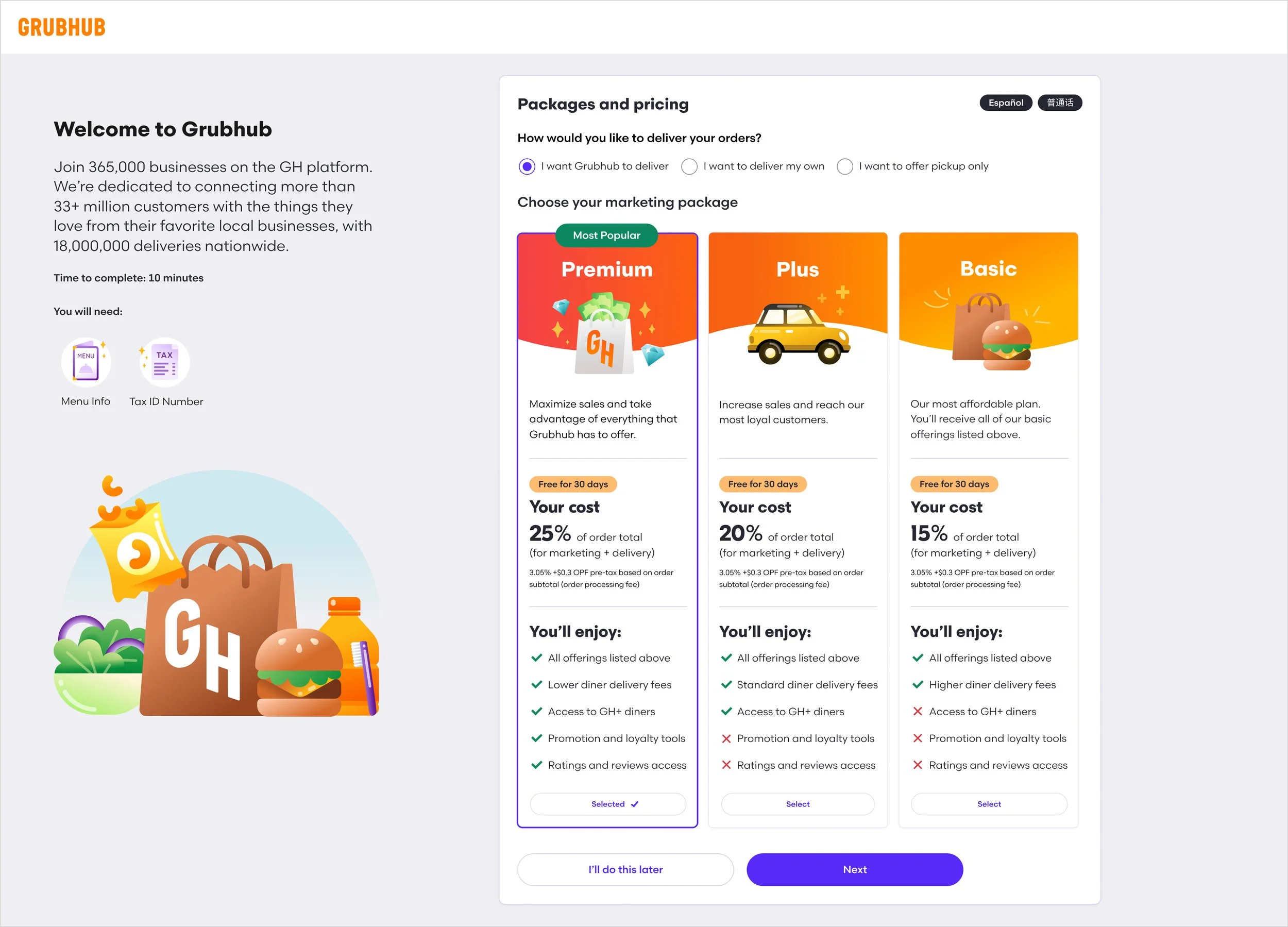
Step 3: Packages and Pricing
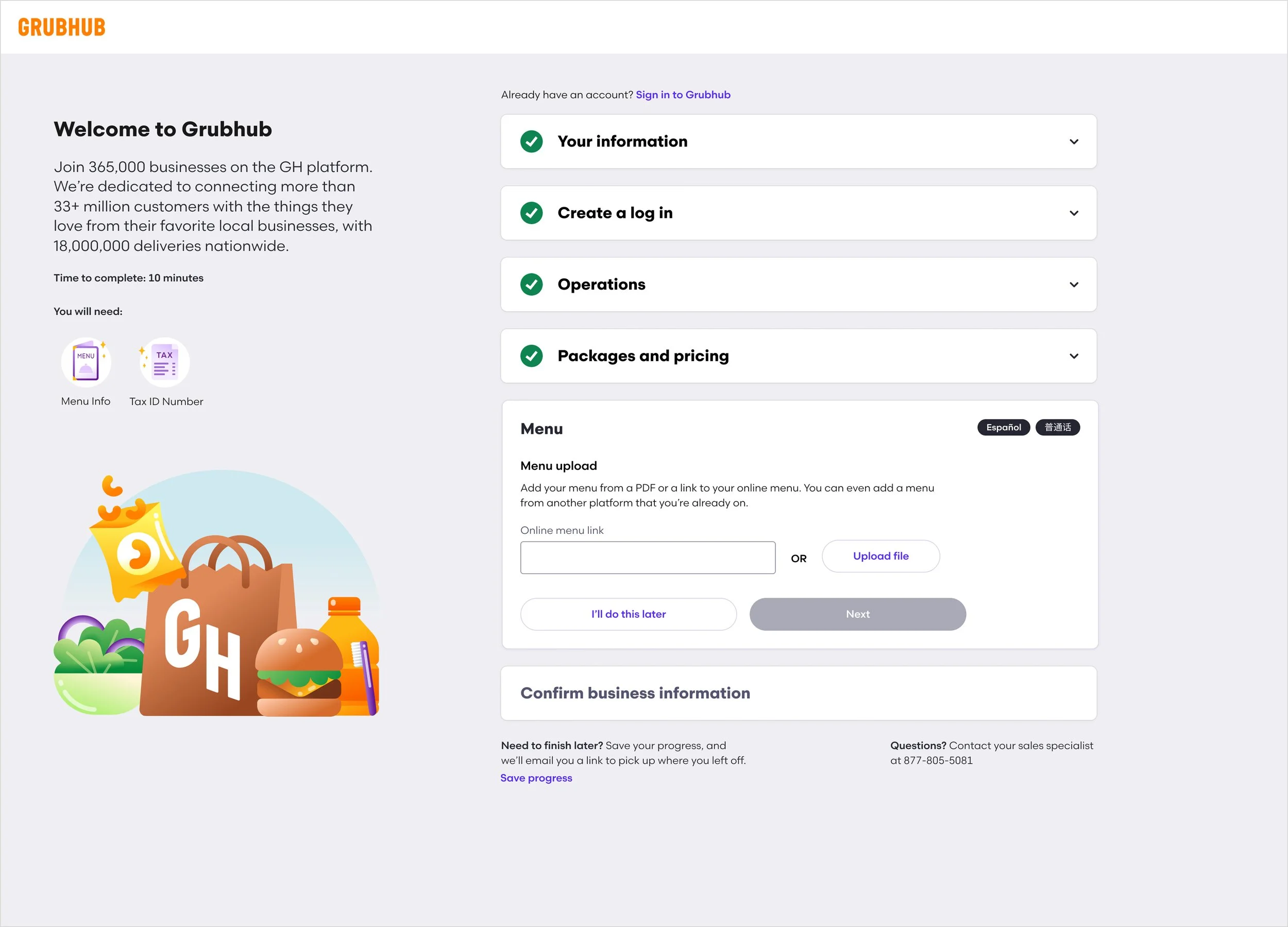
Step 4: Menu
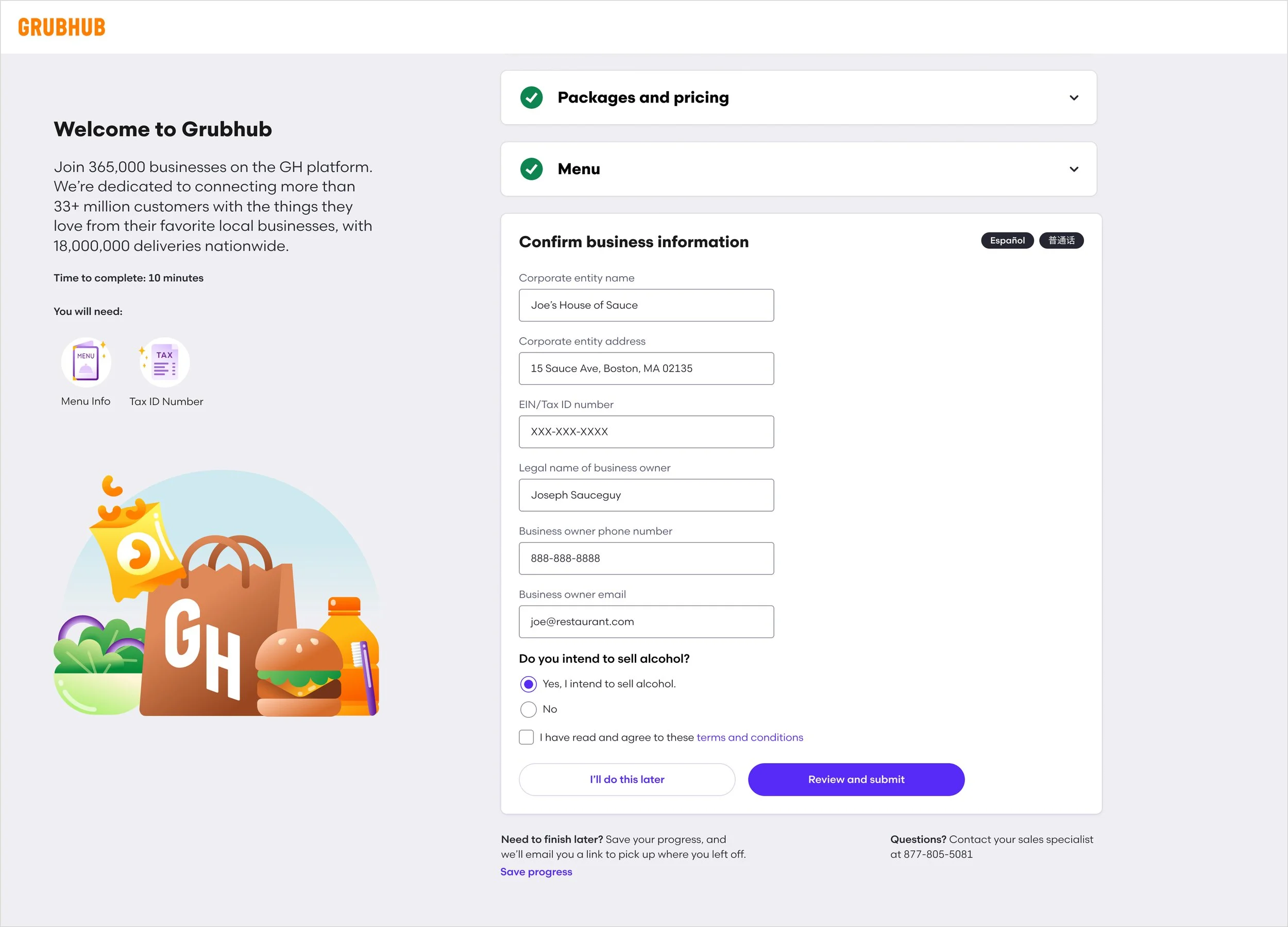
Step 5: Confirm Business Information
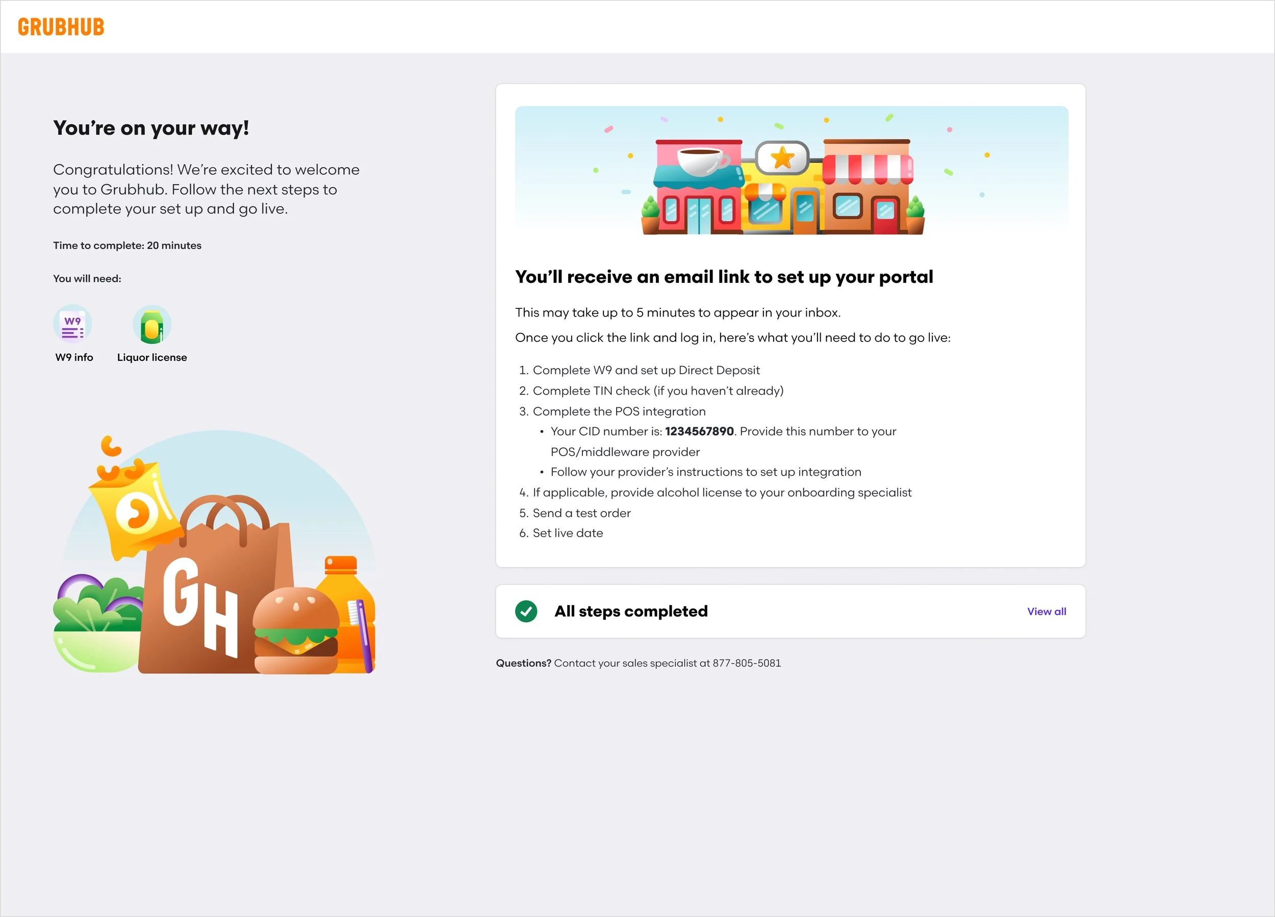
Confirmation Page
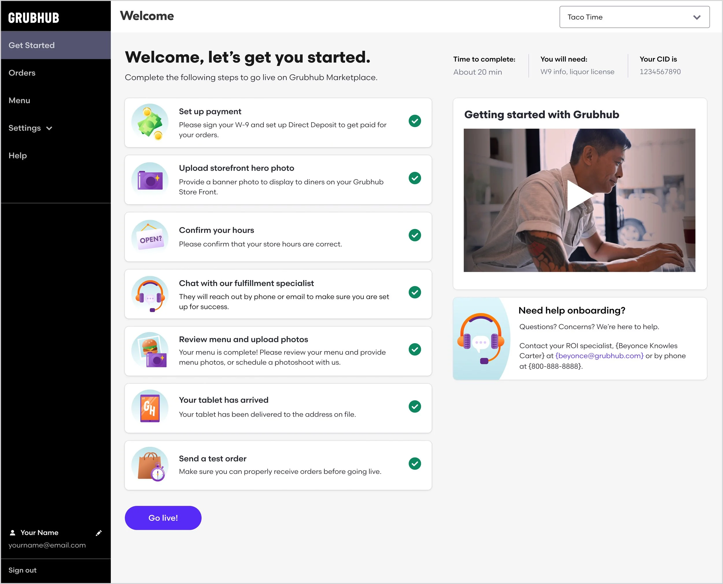
Self Activation Onboarding
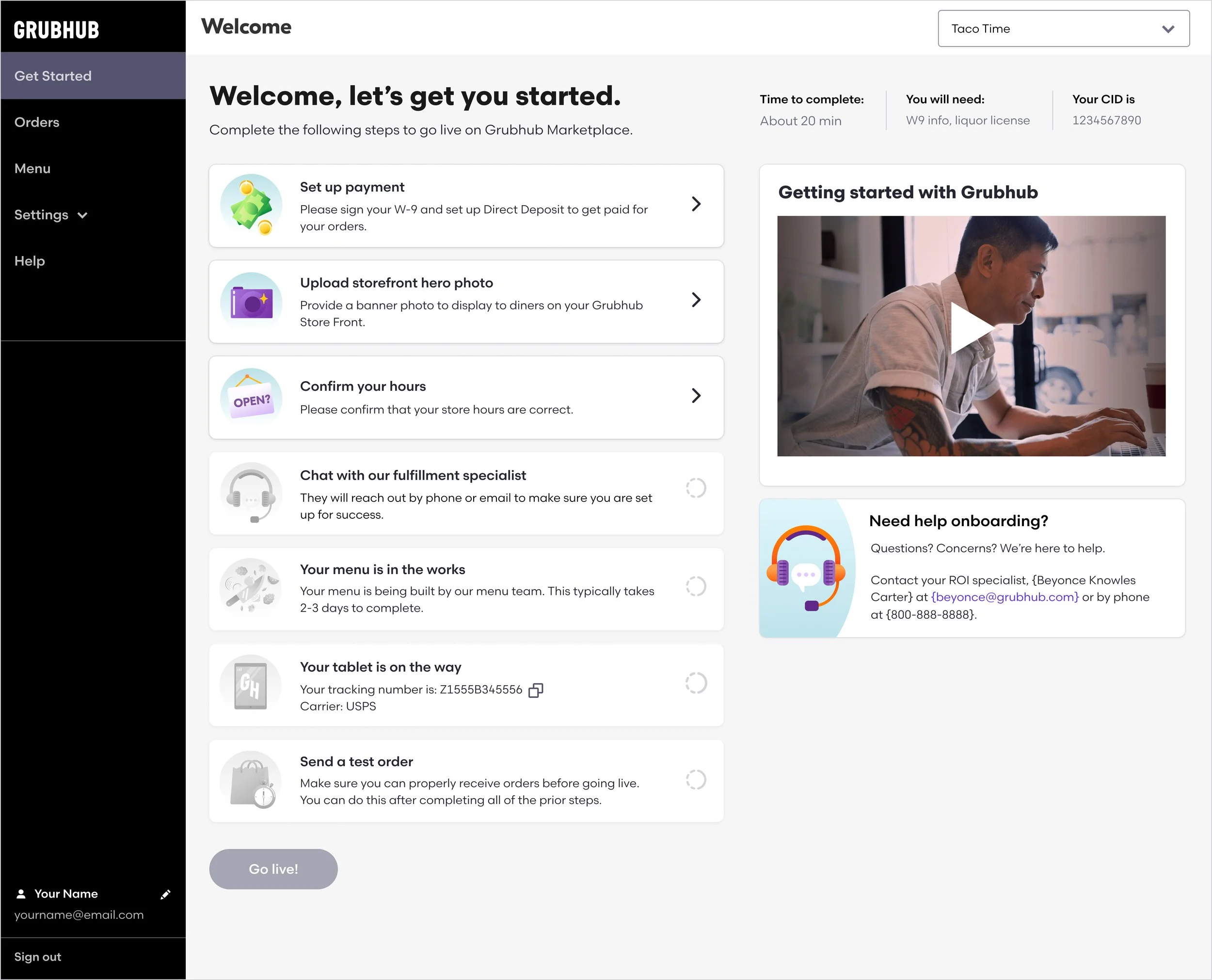
Once the user has completed the Self Sign-Up Flow, they will receive an email directing them to create a login to join Grubhub For Restaurants—Grubhub’s merchant-facing app. Upon logging in, they will land on the onboarding landing page which shows an overview of the tasks they need to complete before going live on Grubhub. Each tile links to an existing page within Grubhub For Restaurants where the user can complete the task. Once the first six steps are completed, the user can then send a test order and go live on Grubhub Marketplace.
We decided to create a separate app from the main site so we could limit the navigation to only what is necessary for onboarding. This helps keep the user focused on the task at hand. We designed the onboarding experience to be simple, straightforward, and visually inviting. The illustrations add a touch of whimsy, as well as a clear indication of what’s required in each step. We added an embedded onboarding video and custom onboarding contact to help the user throughout the process. We also highlighted the time it takes to complete, the information they’ll need, as well as their CID, to provide transparency and ease of use.
Initial landing page
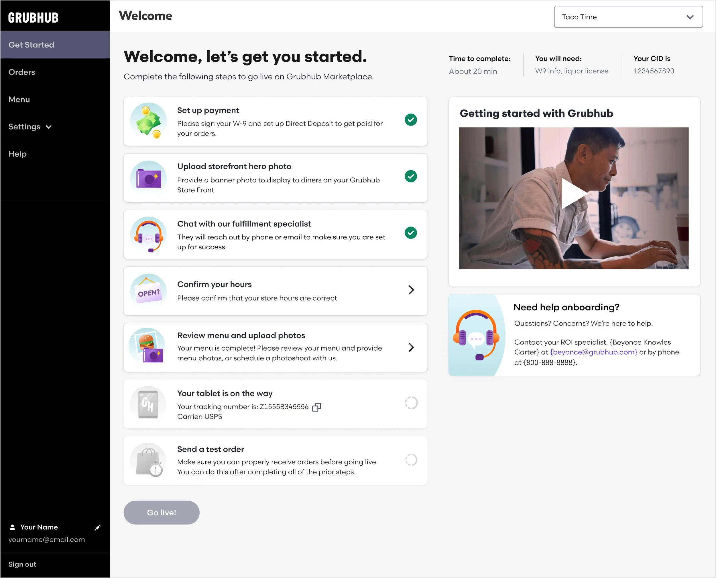
As tasks are completed
Ready to go live
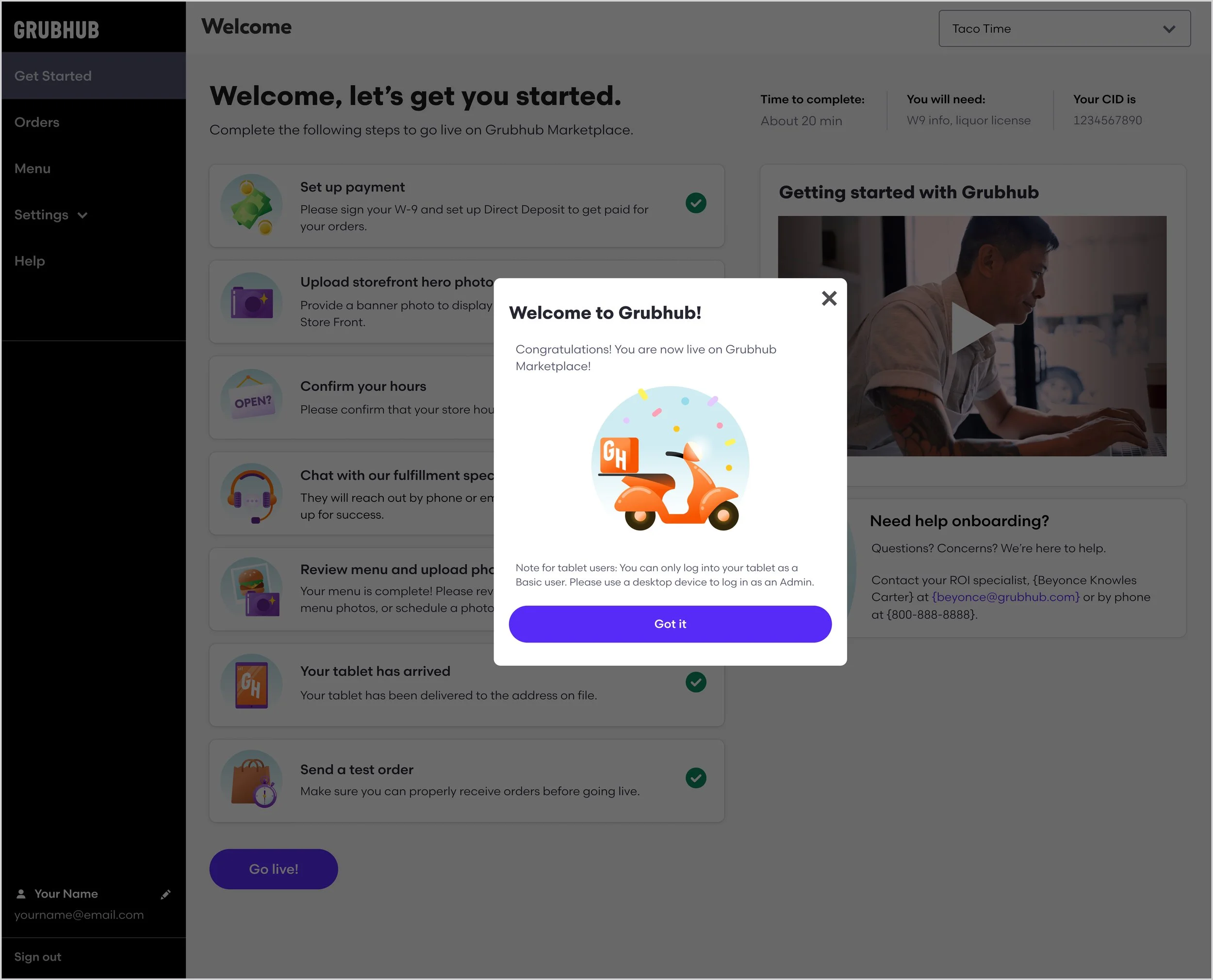
Congratulations modal
The Process
For about six months, we worked with members from Grubhub’s product, sales, marketing, engineering, and legal teams to create the new onboarding process. We started with several brainstorming and working sessions and created some initial user flows to map out our plan and align on our final idea. Then we created low-fi wireframes to align with the teams that this would affect. After, we moved to mid-fi wireframes and finally produced hi-fi designs after all of the feedback and changes were settled.
I tag-teamed the user flows, initial research, wireframing, and mid-fi designs for Lead Capture and Self-Sign Up with another designer.
I owned the hi-fi wireframes for Lead Capture and Self-Sign Up, as well as the entire process (brainstorming, research, wireframing, hi-fi designs, etc) for Post-Contract Onboarding.
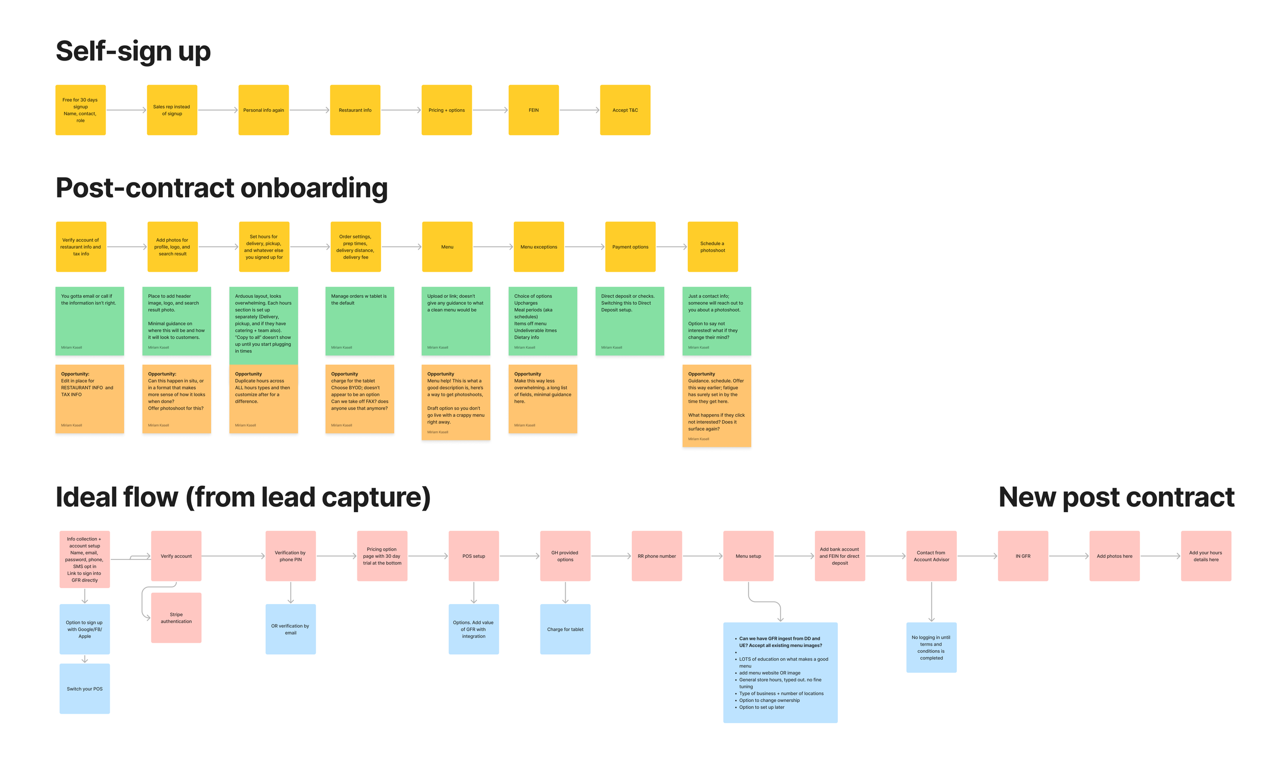
Initial brainstorming
Self Sign-Up wireframes
Self Sign-Up mid-fi designs
Lead Capture mid-fi design