LevelUp
Animating an Onboarding Tutorial
Role: Visual Designer
Timeline: 1 month
Responsibilities: Visual Design, UI Design, Illustration, Motion Design
Tools: Adobe Illustrator, Adobe After Effects, Figma

LevelUp
Animating an Onboarding Tutorial
Role: Visual Designer
Timeline: 1 month
Responsibilities: Visual Design, UI Design, Illustration, Motion Design
Tools: Adobe Illustrator, Adobe After Effects, Figma
Overview
Overview
LevelUp wanted an engaging way to introduce customers to its prepaid ordering experience. I partnered with marketing to create an animated onboarding tutorial that demonstrated the simplicity of the experience from placing an order to skipping the line and enjoying the extra time saved.
The Challenge
The Challenge
The goal was to communicate the value of LevelUp quickly and visually. The experience needed to make the process feel effortless while highlighting the key benefit: spending less time waiting and more time enjoying your meal.
How might we use animated visuals and concise messaging to show customers how easy LevelUp makes ordering and pickup, while communicating the time-saving benefit?
How might we use animated visuals and concise messaging to show customers how easy LevelUp makes ordering and pickup, while communicating the time-saving benefit?
The Process
The Process
Define the story
Define the story
I worked with my marketing partner to map out the high-level user journey and determine how to communicate the experience through a simple visual narrative.
Explore the visual direction
Explore the visual direction
I sketched static illustrations in Adobe Illustrator to explore different compositions, characters, and visual treatments. We used these early concepts to align on the overall look and feel before moving into animation.
Bring the story to life
Bring the story to life
Once the direction was approved, I brought the illustrations into Adobe After Effects and animated each scene. I had very little prior animation experience, so I taught myself After Effects as I worked, experimenting with timing, transitions, and motion to create a polished and approachable experience.
Design the onboarding experience
Design the onboarding experience
After finalizing the animations, I designed the onboarding screens as a three-step carousel and validated the final experience with the marketing team.
Step 1: Place your order
Step 2: Skip the line and pick up your order with no wait
Step 3: Enjoy more time for your meal
I reviewed the final screens with the marketing team and refined the experience based on their feedback.
The Outcome
The Outcome
The final onboarding experience combined illustration, motion, and concise messaging to quickly explain how LevelUp worked and why it mattered. It gave new users an engaging introduction to the core value proposition: order ahead, skip the wait, and enjoy your meal.
Impacts
Impacts
The onboarding tutorial received great feedback from customers and had positive impacts on how they interacted with the LevelUp app.
85% onboarding satisfaction
85% onboarding satisfaction
Per Customer Satisfaction (CSAT) survey.
Per Customer Satisfaction (CSAT) survey.
+30% onboarding completion
+30% onboarding completion
30% more users completed onboarding after the tutorial went live.
30% more users completed onboarding after the tutorial went live.
+25% first-time order placement
+25% first-time order placement
There was a 25% increase in first-time order placement after the tutorial was added.
There was a 25% increase in first-time order placement after the tutorial was added.
Reflection
This project was an opportunity to expand my skill set beyond traditional product and visual design. With limited animation experience, I had to quickly learn After Effects and figure out how to translate static illustrations into a cohesive motion story.
The project also reinforced the value of starting with the story before the visuals. By working closely with marketing to define the narrative and validating the illustrations before animating, I was able to iterate early and avoid investing time in animation before the direction was clear.
Most importantly, I learned how motion can make a complex or unfamiliar product experience feel simple, intuitive, and approachable.
Reflection
This project was an opportunity to expand my skill set beyond traditional product and visual design. With limited animation experience, I had to quickly learn After Effects and figure out how to translate static illustrations into a cohesive motion story.
The project also reinforced the value of starting with the story before the visuals. By working closely with marketing to define the narrative and validating the illustrations before animating, I was able to iterate early and avoid investing time in animation before the direction was clear.
Most importantly, I learned how motion can make a complex or unfamiliar product experience feel simple, intuitive, and approachable.
Grubhub
Increasing onboarding conversion by 150%
Role: Senior Product Designer
Timeline: 6 months
Team: Product Manager, Engineers, Copy, Sales
Responsibilities: Product strategy, AI interaction design, UX research, conversation design, prototyping, usability testing, developer collaboration and handoff
Overview
LevelUp wanted an engaging way to introduce customers to its prepaid ordering experience. I partnered with marketing to create an animated onboarding tutorial that demonstrated the simplicity of the experience from placing an order to skipping the line and enjoying the extra time saved.
The Outcome
The final onboarding experience combined illustration, motion, and concise messaging to quickly explain how LevelUp worked and why it mattered. It gave new users an engaging introduction to the core value proposition: order ahead, skip the wait, and enjoy your meal.
The Outcome
The final onboarding experience combined illustration, motion, and concise messaging to quickly explain how LevelUp worked and why it mattered. It gave new users an engaging introduction to the core value proposition: order ahead, skip the wait, and enjoy your meal.

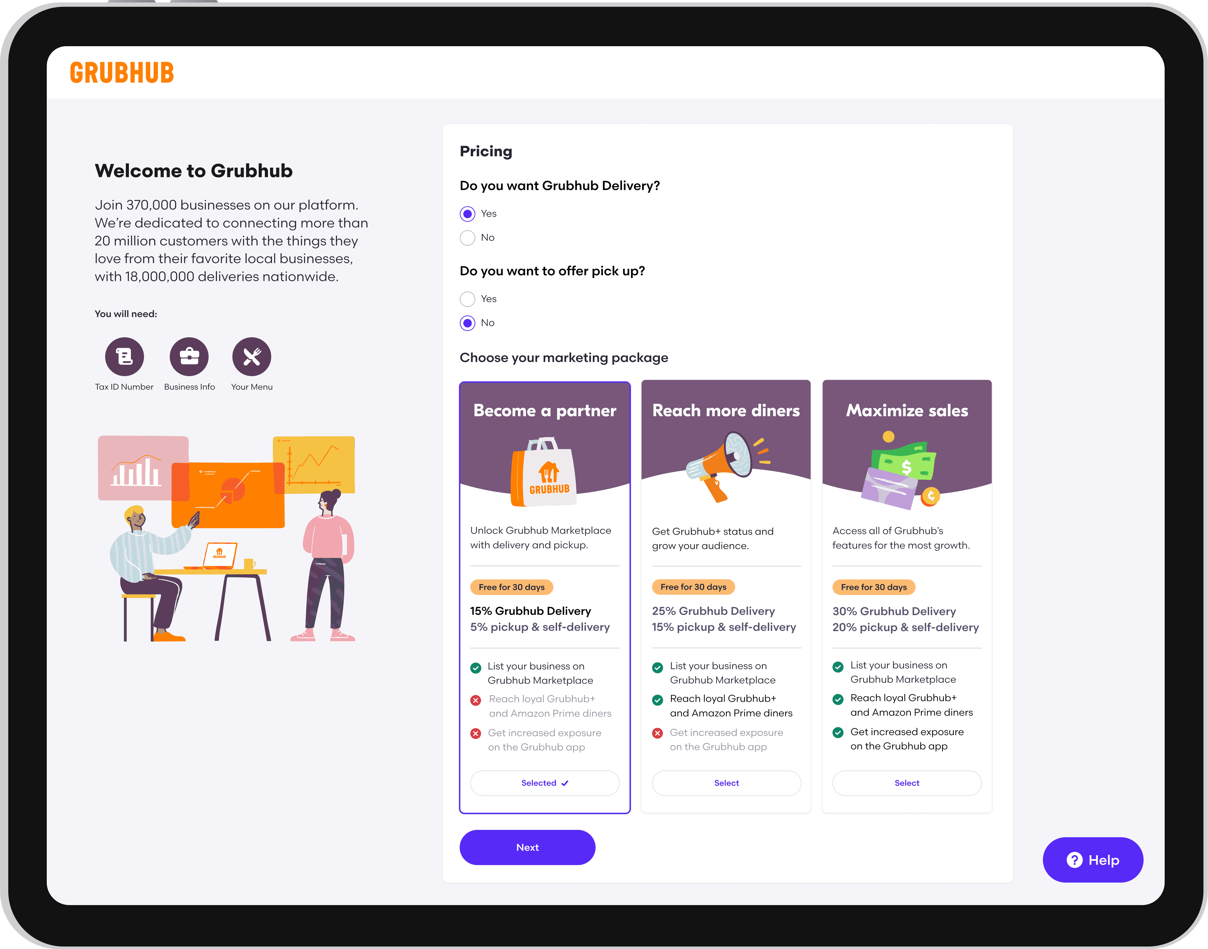
The New Experience
I redesigned pricing around three outcome-oriented plans:
Become a Partner
Reach More Diners
Maximize Sales
Each option included a scannable comparison of features, exclusions, fees, and expected value. A 30-day free trial reduced the perceived risk of selecting a plan.
Rather than presenting pricing as an isolated transactional decision, the experience connected each plan to the merchant’s business goals.
Transparent Plan Selection
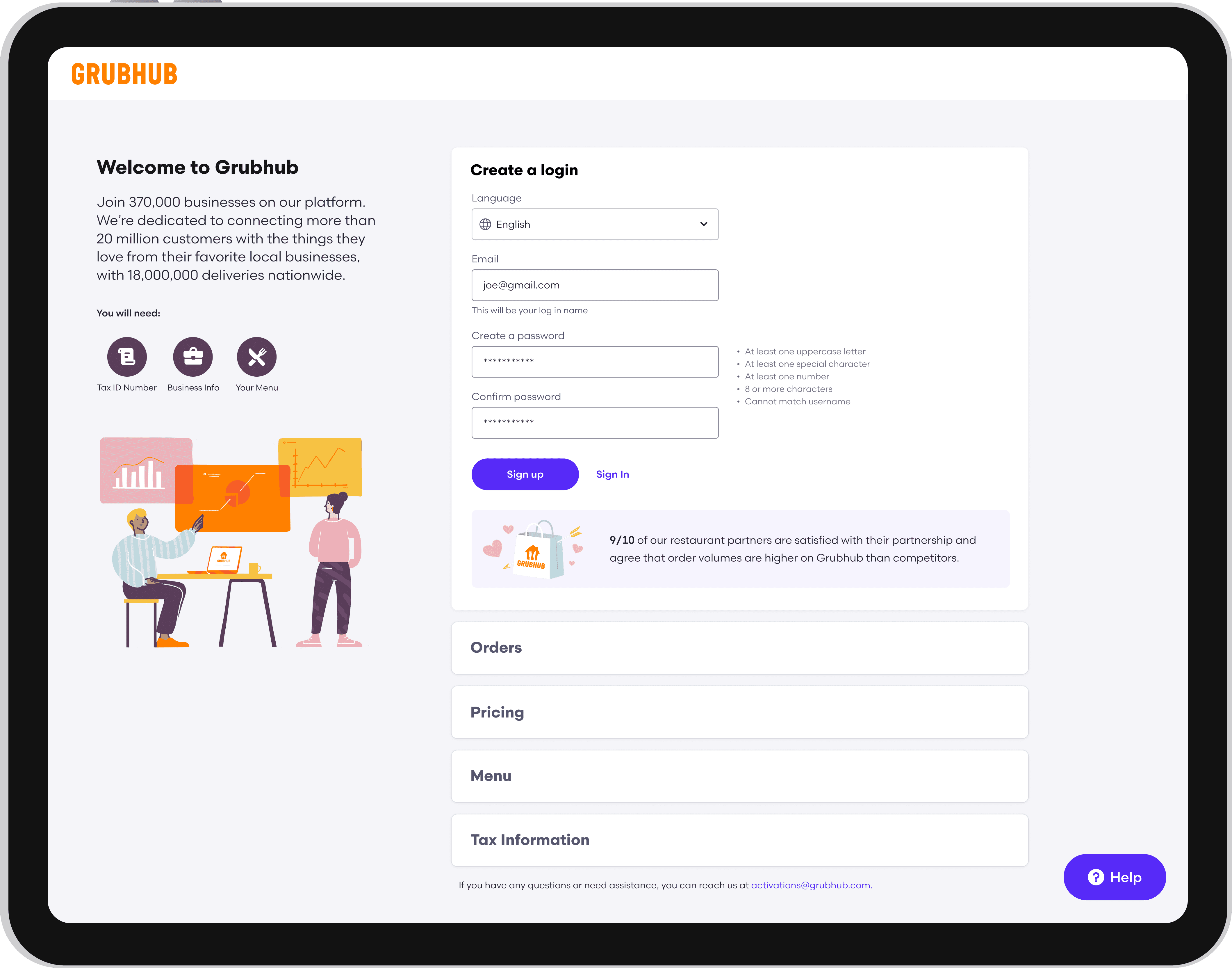
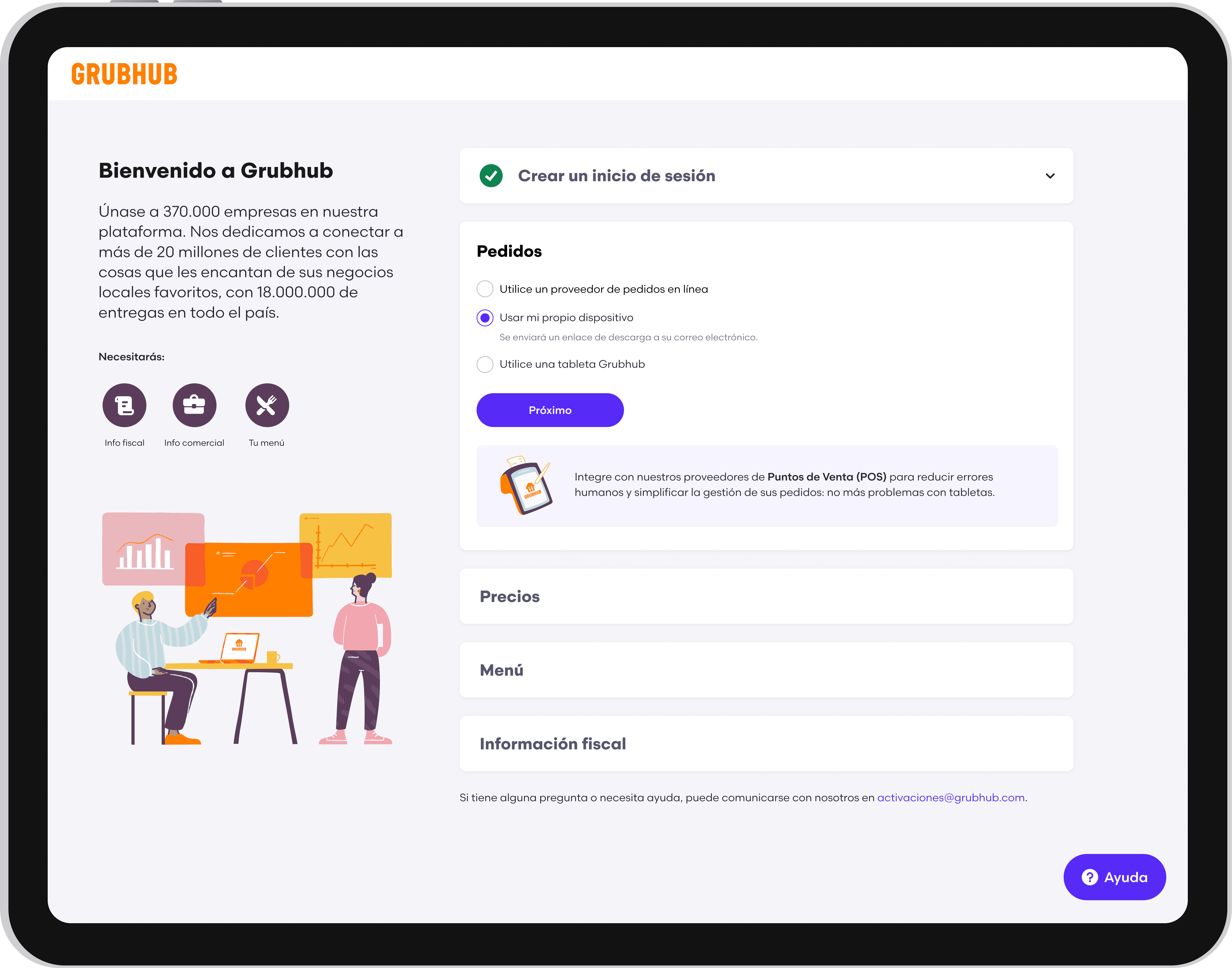
Upfront Requirements
Before beginning, merchants received a clear overview of:
Expected completion time
Information and documents they would need
Required and optional sections
What would happen after submission
This helped merchants prepare before entering the flow and reduced unexpected interruptions.Rather than presenting pricing as an isolated transactional decision, the experience connected each plan to the merchant’s business goals.
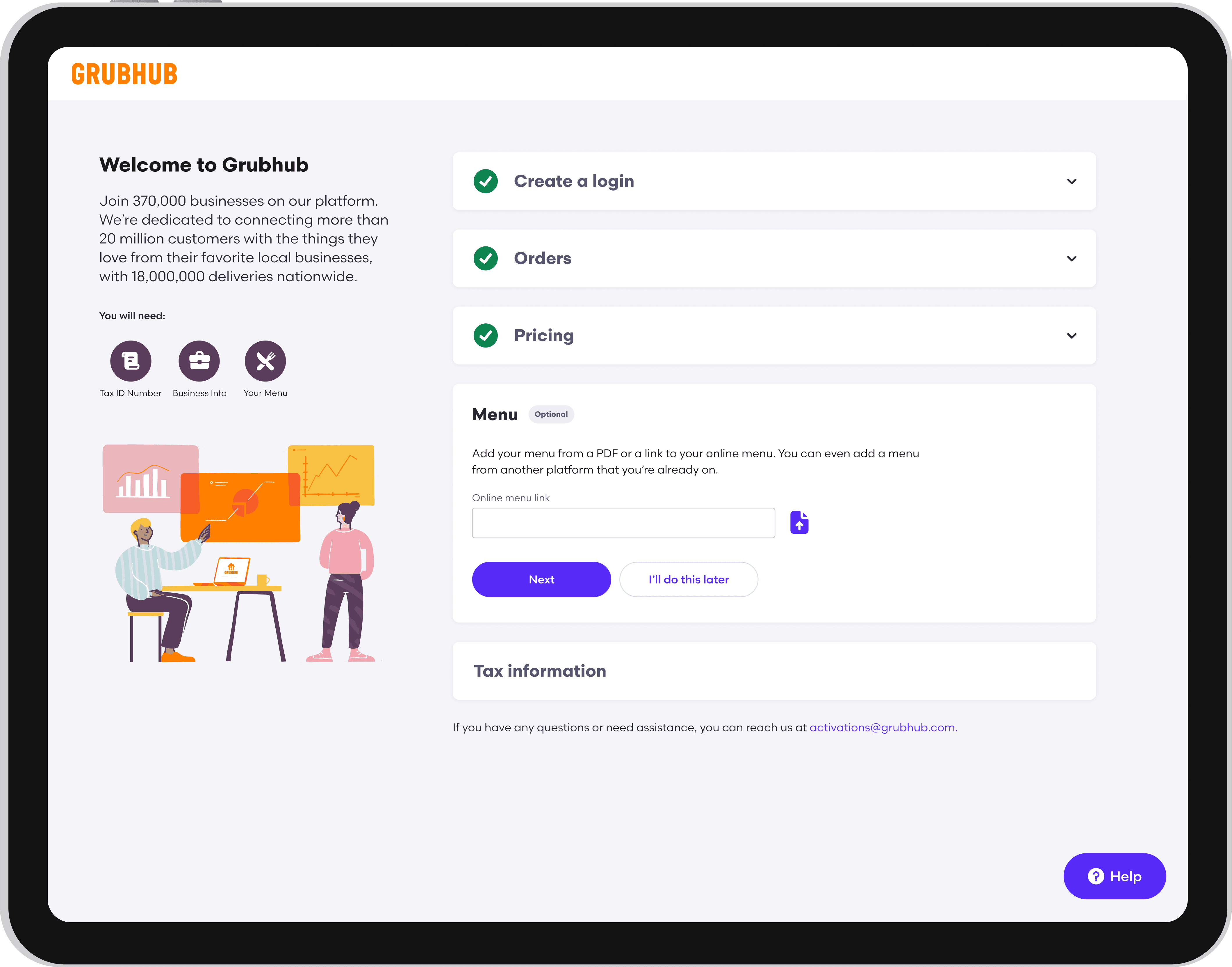
Flexible Completion
Nonessential steps could be skipped and completed later within Grubhub for Restaurants.
This allowed merchants to make progress even when they did not have every piece of information available, while preserving the requirements necessary to activate their account.
Multilingual Onboarding
Merchants could select their preferred language from the initial signup page, translating the full onboarding experience into the languages most commonly used by Grubhub’s merchant community.
Translation was integrated into the experience architecture rather than added as a page-level workaround, creating a consistent journey from signup through completion.
AI Guidance
I designed GrubBot, an AI-assisted onboarding companion that provided contextual support without requiring merchants to leave the flow.
GrubBot could:
Explain unfamiliar requirements
Answer frequently asked questions
Clarify terminology
Direct merchants to the appropriate section
Provide structured prompts based on where they were in the process
To make the assistant predictable and trustworthy, I designed clear entry points, constrained response paths, and contextual recommendations rather than relying solely on an open-ended chat interface.
The interaction model was refined through iterative testing to ensure that AI assistance complemented the core experience instead of becoming another layer merchants had to understand.

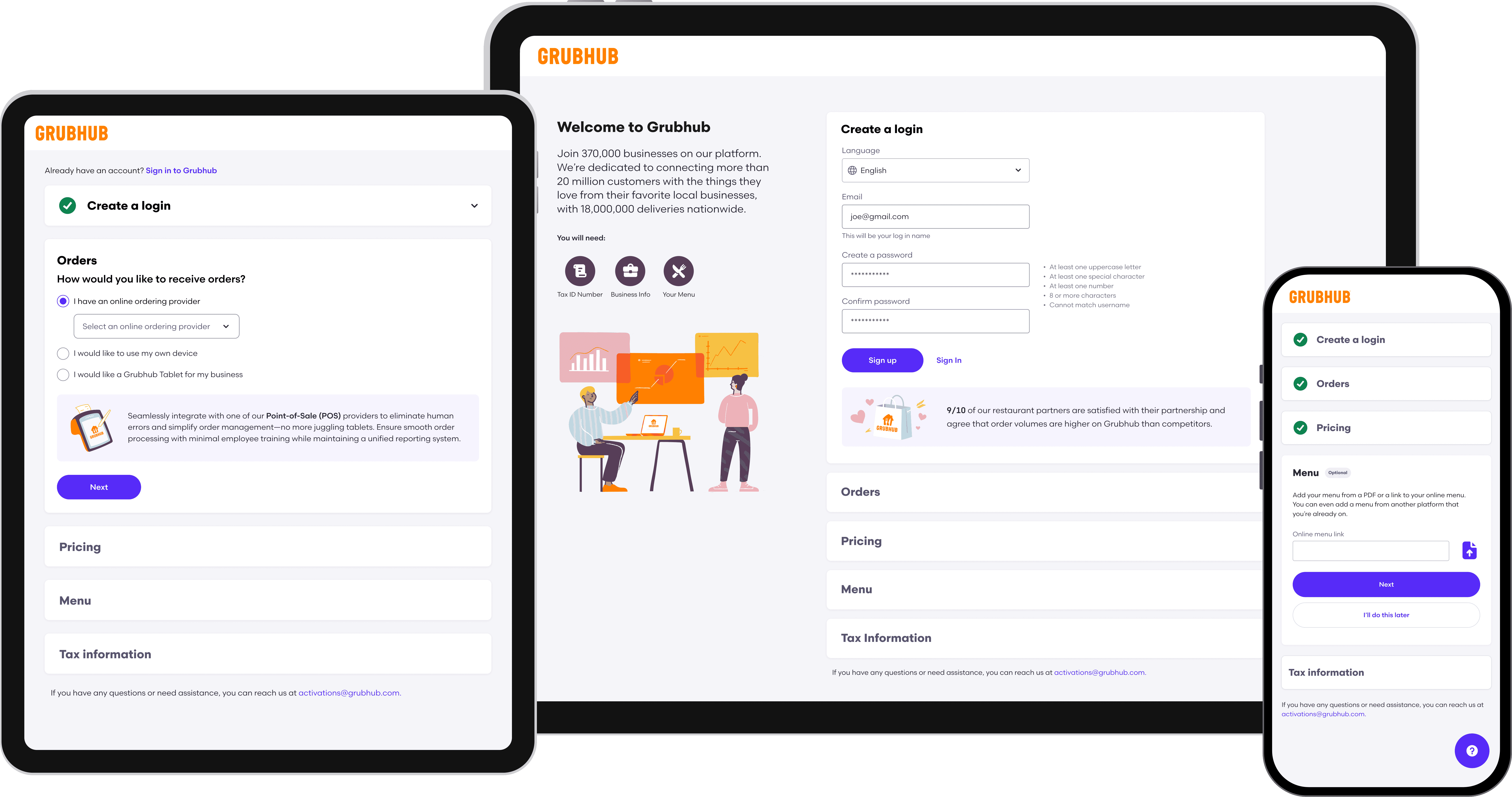
Responsive Access
The redesigned flow supported desktop, tablet, and mobile devices. This was particularly important for restaurant operators, who often manage their businesses away from a desk and may need to complete onboarding between operational tasks.
Responsive layouts preserved hierarchy, progress visibility, and editing functionality across screen sizes.
The Process
Define the story
I worked with my marketing partner to map out the high-level user journey and determine how to communicate the experience through a simple visual narrative.
Explore the visual direction
I sketched static illustrations in Adobe Illustrator to explore different compositions, characters, and visual treatments. We used these early concepts to align on the overall look and feel before moving into animation.
Bring the story to life
Once the direction was approved, I brought the illustrations into Adobe After Effects and animated each scene. I had very little prior animation experience, so I taught myself After Effects as I worked, experimenting with timing, transitions, and motion to create a polished and approachable experience.
Design the onboarding experience
After finalizing the animations, I designed the onboarding screens as a three-step carousel and validated the final experience with the marketing team.
Step 1: Place your order
Step 2: Skip the line and pick up your order with no wait
Step 3: Enjoy more time for your meal
I reviewed the final screens with the marketing team and refined the experience based on their feedback.
Impacts
+30% onboarding completion
30% more users completed onboarding after the tutorial went live.
85% onboarding satisfaction
Per Customer Satisfaction (CSAT) survey.
+25% first-time order placement
There was a 25% increase in first-time order placement after the tutorial was added.
$10–20M annual revenue opportunity
Sponsored Ads opened a significant new revenue channel for Grubhub.
$9K in daily revenue after launch
Early adoption demonstrated immediate merchant demand for the product.
30% increase in monthly orders
Participating merchants saw meaningful order growth, including orders from new customers.
6x average Return on Ad Spend (ROAS)
Merchants generated approximately $6 in return for every $1 invested in Sponsored Ads.
The onboarding tutorial received great feedback from customers and had positive impacts on how they interacted with the LevelUp app.
Reflection
This project was an opportunity to expand my skill set beyond traditional product and visual design. With limited animation experience, I had to quickly learn After Effects and figure out how to translate static illustrations into a cohesive motion story.
The project also reinforced the value of starting with the story before the visuals. By working closely with marketing to define the narrative and validating the illustrations before animating, I was able to iterate early and avoid investing time in animation before the direction was clear.
Most importantly, I learned how motion can make a complex or unfamiliar product experience feel simple, intuitive, and approachable.
The Challenge
The goal was to communicate the value of LevelUp quickly and visually. The experience needed to make the process feel effortless while highlighting the key benefit: spending less time waiting and more time enjoying your meal.
How might we use animated visuals and concise messaging to show customers how easy LevelUp makes ordering and pickup, while communicating the time-saving benefit?